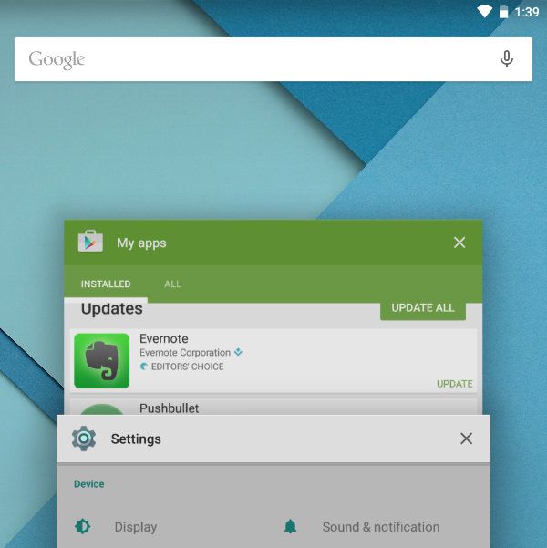
Lollipop brings in significant changes to the way Android switches back and forth between recent apps. In KitKat, this feature worked the same way it did in Honeycomb, Ice Cream Sandwich, and Jelly Bean. In short, you clicked the third icon in the navigation bar at the bottom, and the recent apps appeared as a list of thumbnails and app icons arranged into a column.
With Android 5.0, the entire look and feel changes. Apps are arranged into pages that you flip through, an effect not radically different from the methods we've seen from previous versions of Sense and other UIs. We showed you this already in our initial hands-on of the Android L Developer Preview several months ago, so here is what's new: a Google Search bar now stretches across the top of the recents screen.
Between the search bar at the top of the homescreen, its presence in Google Now, the "OK Google" hotword, and the ability to access search by swiping up from the bottom of the screen, Google really wants to making searching accessible at all times. Considering that the company originally built itself up around a search engine, can you blame it?

