Included in Android's design guidelines is a section regarding iconography. The guidelines give very specific instructions on how to design a launcher icon for Android - it should have a unique silhouette, it should have a slight downward perspective, and it should be clearly visible no matter what wallpaper is behind it.
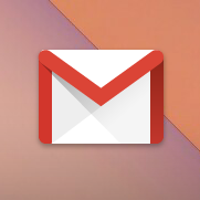
Many have opined, however, that it's odd that Google maintains different iconography for its apps on Android and their corresponding web services. For instance, on the web, Gmail's icon is a flat, closed envelope, with a long shadow, while on Android it's a more dimensional open envelope with the M appearing on the "paper" inside.
Gmail's web icon vs Android counterpart
It could be argued that having different icons for different platforms makes sense, but if today's rumor is to be believed, Android's icons may soon take a step toward the style of their web counterparts.
[leak_disclaimer]
Confidence Level
This rumor gets a 7/10. Points are deducted because purely design-based changes can fluctuate quite a bit leading up to final release, and because we do not have any software-based evidence for these changes (like icons hiding in an APK teardown for instance). That said, from the information available to us, it seems likely that this rumor will come to fruition in some form, even if what we are looking at is not the final product.
The Rumor
The rumor, if you haven't guessed it already, is that Google will be changing the style of its launcher icons for Android apps to more closely resemble those of its web properties. This new style, internally referred to as "Moonshine" would see Android icons take on a somewhat flatter appearance, with long, hard shadows behind prominent elements, reminiscent of what can be seen in Google's existing visual asset guidelines (see them on Behance).
The implication here, besides pretty new icons, would be that Android's design guidelines would need to be updated. Suddenly, square or circular boilerplate icons would look a little out of place, and those with textures or other dimensional elements would need to fall into line with this new style to stay current.
What's interesting, though, is that the icons we see (below) that do have corresponding web icons aren't identical to existing web icons - these icons look different and more sophisticated. It's difficult to account for this discrepancy unless Google plans to update the iconography of its web products with the new aesthetic as well. In an ideal world, things would either be identical or different, not just pretty similar, but if the icons on Android and the web were both updated, it'd be a welcome change since - as we'll see - not all of Google's web icons even carry the same aesthetic.
The Evidence
Thanks to a source familiar with the new designs, we can see below icons for Play Music, Books, Movies, and Games, alongside Google+, Calendar, People, Chrome, YouTube, Maps, Gmail, Hangouts, Camera, and the Play Store. Interestingly, the Play Store icon seen here has a Play symbol with a bluish green color scheme rather than the multicolored scheme currently embedded in Play Store branding. Additionally, while Music, Books, and Games have apparently retained their current brand colors, Movies has a purple icon. Again though, there's no real way to be certain where in the design process these icons are, so everything is possibly subject to change.
To more easily visualize the change, let's look at the icons above that have corresponding web icons compared to their current web and Android counterparts. Again note that while, according to Google's visual guidelines, the web icons should theoretically all appear relatively flat with hard shadows, the current web icons can't really be called consistent in their approach. Likewise, the current Android icons do not all perfectly match the suggestions laid forth in Android's guidelines.
Left: current web icons Middle: current Android icons Right: rumored Android icons
Update
Update 4/14/14 10am PT: We now have one more bit of evidence that these icons are likely the real deal. The below screenshot of a Google Partners page (access code required) shows what appear to be the Calendar, YouTube, and Maps icons we see above. This doesn't confirm that the icons will be coming to Android, but does suggest that they are real, and could well appear elsewhere. (Thanks, Florian!)
Final Thoughts
If the rumor pans out, Google's Android icons are going to get a makeover. Whether these are the icons' final forms is impossible to say at the moment, but it would be interesting to see a flatter aesthetic take hold, more in line with the simplified, distilled nature of Google's current web icons. It will also be interesting to see what changes this brings to existing guidelines. Here's hoping that - whenever the change occurs - we'll get some sort of consistency.