While mobile announcements aren't generally a major thing we expect to see at CES, Samsung decided it would be generous and throw out a handful of new tablets in between its 4K TVs and new smart appliances. I'm talking of course about the new Tab Pro and Note Pro series – a premium lineup of new Samsung kit in a variety of sizes with a fresh new UI.
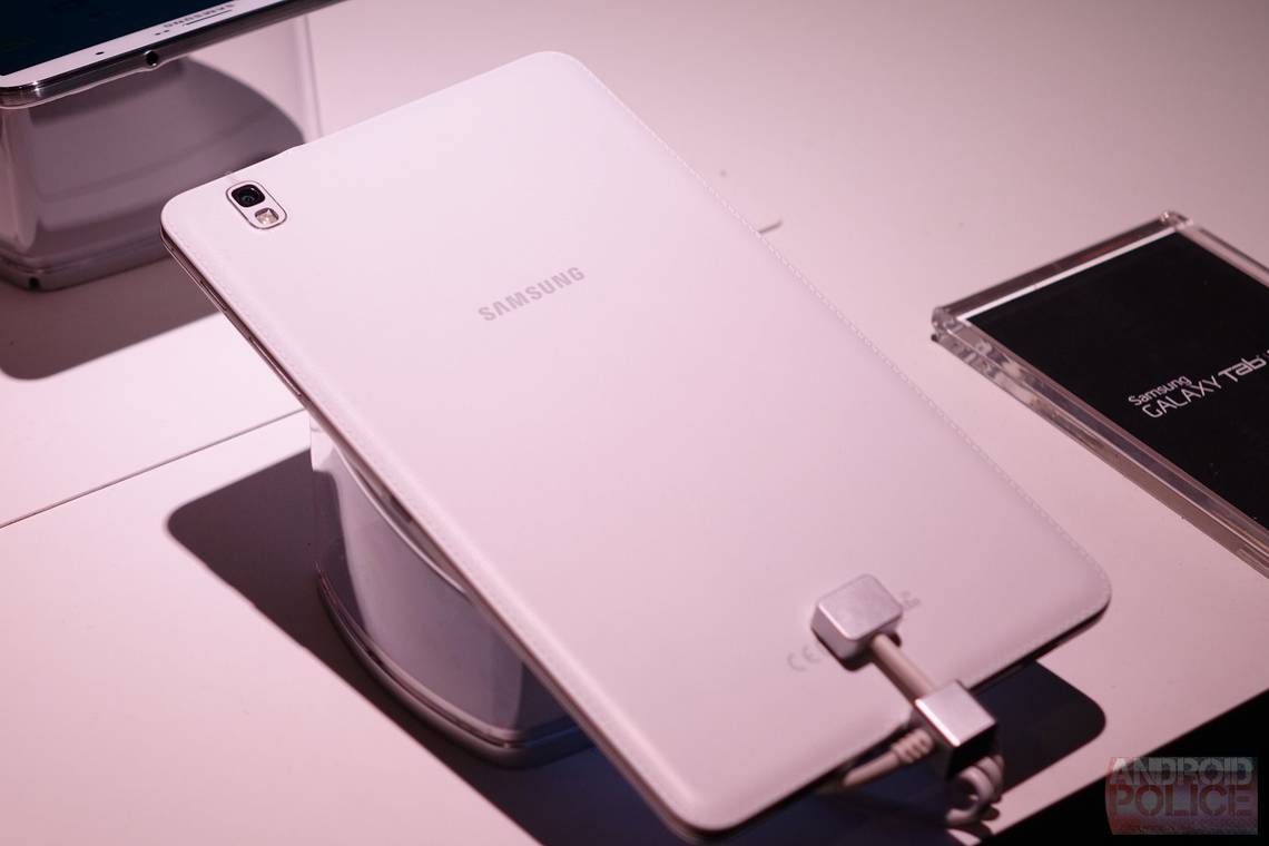
This quartet of tablets should look pretty familiar for anyone who's seen Samsung's 2014 Note 10.1 or Note 3 – they're stylistically identical, including the faux leather backing, stitching, and aluminum banding. They feel nice and well made for the most part, and the two smaller models are surprisingly light.
The Tab Pro lineup has three different sizes to choose from: 12.2 inches, 10.1 inches, and 8.4 inches, while the Note Pro is only available in the largest sizes (12.2 inches). Otherwise, all four units share the same specs, which includes a 2560x1600 display (yes, even on the 8.4 inch model), Snapdragon 800 (US models; the international models will feature a Exynos Octa), 3GB RAM, and Android 4.4.2. The most drastic change Samsung made to those tablets, however, is the user interface.
[EMBED_YT]https://youtu.be/xttKW5l-BuI
[/EMBED_YT]
Throwing out the old-school Crayola color explosion formerly known as TouchWiz, the new "Magazine UX" takes a fresh – albeit slightly overbearing – approach to how Samsung thinks its users should be using tablets. The entire launcher is aligned to a grid where content can be snapped in – very much like Chameleon launcher, though without the time-and location-based awareness. Think of it like a basic version of Chameleon blended with Flipboard, because that's basically what it is.
While that may sound pretty terrible to some, it's actually not awful. It's clear that Samsung is working towards making a cleaner, more usable user interface, and Magazine is the start of that. There is one traditional-style homescreen thrown into the mix for those who want it, but widgets and apps still align to the same grid that the other screen uses, so it's not exactly a stock experience. Again, it's not terrible, but it's probably less than ideal for the Android power users out there.
[EMBED_YT]https://youtu.be/ZZ2mXwtoE-c
[/EMBED_YT]
The units we were able to spend some time with were running pre-release software (naturally), but there are definitely some noteworthy (puns, haha) idiosyncrasies with the interface that Samsung will hopefully address before the public release – namely, the fact that the notification bar disappears on the homescreens. Magazine UX is basically full screen all the time, so in order to see the notification bar, a quick swipe down from the top is necessary. Within five minutes of using any of the new Pro devices, this was already the most annoying aspect – the notification bar is something that should always be visible. Not only that, but it requires two pulls to access the notification area – the first one to display the bar itself, and the second to actually access the panel itself.
Overall the Pro series tablets are something for those looking for a little extra oomph from the tablet experience, be that in size or just overall processing power. The 8.4 and 10.1 inch models are both nice additions to the Tab family, and the first high end devices carrying the name that we've seen in years. The 12.2 inch Tab and Note Pro are probably the standout devices of the new Pro lineup, as they're the first to carry this extra-large form factor. While they may not be for everyone, there's no question that someone out there is in the market for a 12+ inch tablet. And really, despite the seemingly large form factor, they don't feel all that cumbersome, at least not in the few minute timeframe I got to use them. It's hard to say how I'll feel after more time with the devices – I guess we'll have to wait till review units are available for that.