There are a plethora of little visual tweaks in Android 4.4, but few of them will be in your face as much as the new white status bar icons. The decision to move away from Holo blue was a bit surprising, but removing the color-based connectivity indicator? What gives? Well, a Google engineer has chimed in on Google+ to explain the rationale.
According to Android engineer Dan Sandler, the white icons were originally chosen to present a more neutral palette that works better with apps. It also turns out that #33b5e5 blue doesn't show up very well with the transparent status bar. Prior to KitKat, stock Android had a really handy way of letting you know whether or not you were connected to Google services (which was usually an indication of your general internet connectivity). A blue WiFi or mobile data icon meant connected, and gray was no connectivity. But no more.
Android 4.3 behavior
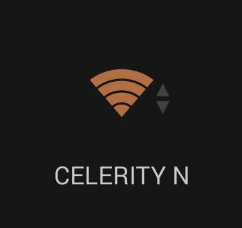
In KitKat, the status icons are white all the time. If you want to see your status, it's in the Quick Settings and orange is used to denote no connectivity. Google did this primarily because most users didn't know what the colors meant. It was, in the team's estimation, an unnecessary UI element that was more confusing than helpful for the majority of users. So now if you want to know your status, it's one more step away in Quick Settings. That sounds like an acceptable compromise, right?
4.4 Quick Settings showing no connectivity
Lastly, you might have noticed the up/down network activity arrows are gone from the signal indicator. They've been booted to Quick Settings as well because it actually takes a noticeable amount of CPU and GPU time to render those flashing arrows as data packets transit the radios. Moving them saves resources and makes the main home interface cleaner.
Now that you know Google's reasoning, maybe you can come to terms with the change. Here's what Dan had to say in his own words:
Seems like this is as good a place as any to explain the changes to the system status icon colors in KK.
1. Whiten ALL the status bar icons! Aesthetic concerns definitely factored into this (as has been mentioned elsewhere, a more neutral SystemUI allows apps to manage their own color palettes a bit better), but also keep in mind that with the new translucent bars feature, the color became a usability problem. Good old 33b5e5 doesn't pop as well on top of random wallpapers, even with the background protection.
2. What about the
MCSGCM indicator? +Liam Spradlin basically called it: “Overall, network connectivity has been made strangely more opaque in KitKat, though for many average users this isn't a huge concern.” In fact,most users find the colors confusing, if they notice them at all. Even the vanishingly small fraction of users who understood what the gray meant only really looked for it when things weren't working right; now you and I just have to remember to actually pop into quick settings to look for things like GCM liveness (orange is the new gray) and in/out indicators. Which brings me to…
3. B—BUT MY BLINKENLIGHTS?! So this (the removal of the little in/out data traffic arrows from the RSSI) was mostly a performance consideration, believe it or not. The way the data bits are bubbled up and drawn was not only causing a ton of extra rendering work, but actually forcing a layout (!) in the status bar as well. We could have more aggressively cached the bitmaps (rather than creating new BitmapDrawables from resource IDs every time, which was causing the relayout) but that would still have left all the drawing—multiple times per second in some cases—sucking away precious CPU and GPU from your game or Launcher animations or whatever. In the end it seemed like a lot of work (and battery) for what was effectively visual noise, so this too was booted to Quick Settings where it would be available for us nerds.