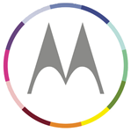
If you take a look at Motorola Mobility's company branding, you'd be hard-pressed to find much that's changed since Google bought them almost two years ago. Today that changes... a little. The Verge found the logo above in the site for Techweek, a Moto-sponsored technology show taking place in Chicago on June 27th. The new logo surrounds the familiar "M" with a segmented color wheel, and swaps out the all-caps name for a softer font with "a Google company" beneath it.
In truth, Motorola's rebrand does very little to change the actual company logo - and why should it? The Moto "M" has been around in one form or another or decades. But now it's got a splash of color instead of the old red or black. Our own Liam Spradlin found a few Techweek page elements that support the change in color. If the logos for below are any indication, the familiar filled circle will shift color to suit different situations. The words "a Google company" appear below the new lowercase logo with a monochromatic version of the official Google font. It seems Motorola has finally gotten over their obsession with ALL CAPS.
Motorola is pushing the Google angle hard, and it's easy to see why. They've lost marketshare to Samsung in the last few years (just like everyone else) and an association with their new owners, the keepers of the keys to Android, couldn't hurt.
Motorola CEO Dennis Woodside said that the first phone developed since the acquisition would be the Moto X, due in late summer or early fall, and manufactured in a Texas assembly plant. Expect to see these branding elements in the software of the Moto X, and probably the marketing for that and later hardware as well.
Source: The Verge

