The HTC One X was (and still is) a fantastic device thanks to its solid hardware, excellent build quality, and stunning display. But it's a little long in the tooth, partially because the newest high-end smartphones have both quad-core CPUs and LTE, and partially because in the smartphone world, anything that's 7 months old is (unfortunately) outdated.
That brings us to the HTC One X+, which is more of a mid-cycle refresh than an all-new model. It keeps the same basic frame and the outstanding display, but packs a more powerful version of NVIDIA's quad-core Tegra 3 CPU, and the AT&T variant even comes with LTE. HTC has also upped the battery capacity and doubled the maximum storage, to 64GB. The outstanding (and indestructible) polycarbonate body is now rubberized, so it's grippier and much more attractive.
They may be minor changes, but the sum of the parts makes a great phone even better.
The Specs
- Price: $200 on contract, $550 retail
- Availability: November 15, 2012 (Europe), November 16, 2012 (US, AT&T)
- CPU: 1.7GHz NVIDIA Tegra 3 CPU (AP37)
- Memory: 1GB DDR3 RAM, 64GB storage
- Display: 4.7" SuperLCD 2 @ 1280 x 720
- Camera: 8MP rear, 1.6MP front
- Battery: 2100mAh
- OS: Android 4.1 (Jelly Bean) with Sense 4+ UI
- Connectivity: 802.11a/b/g/n, Bluetooth 4.0, HSPA+, LTE (AT&T)
- Dimensions: 134.36 x 69.9 x 8.9mm, 135 grams
The Good
- The same display was outstanding on the One X, and it's just as outstanding here. In fact, I can't think of a single shortcoming with it. It's bright, crisp, and colors are great. What's not to love?
- The build is amazing. They took the virtually indestructible polycarbonate of the original and rubberized it. If nuclear war broke out, only cockroaches and HTC One X(+)s would be left - but the plusses would feel fantastic to the touch.
- As speedy and smooth as can be. Granted, I feel like just about every new Android device is snappy thanks to the current crop of processors and the polish of Android 4.0/4.1/4.2, but the point remains that even with all the bloat from Sense, every action is instant.
- Excluding the red capacitive buttons, it looks excellent. Between the matte rubberized coating that seems to absorb all the light in the area and the red accents, it just looks downright sinster.
- Sense 4+ offers a few seriously great features, such as the quick camera startup and burst mode. Plus, it's better for the non-techies.
The Bad
- Sense 4+ is bloated and ugly-ish. It's good for some people (read: my tech-challenged mother), but not for me. It also replaces some stock Android apps (such as Gallery) with crappy HTC versions.
Deep Dive
Build quality
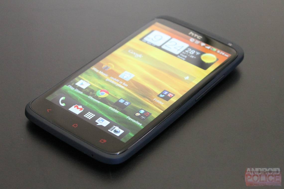
The build quality of the One X is excellent - worlds better than any other Android devices on the market. With the One X+, HTC has kicked it up a notch further. It retains the indestructible polycarbonate body, but it has now gained a rubberized coating. Not only does that improve feel and durability, but it's much more attractive and stylish than the original. Calling the finish matte is an understatement - it's almost a light-consuming black that's broken only by the red accents around the camera, for the Beats logo, and on the capacitive touch keys. In fact, the only weak spot to the appearance is that the deep red color of the capacitive touch buttons just feels like a bit too much; that said, I can't think of any other color that would work, so take that minor complaint with a grain of salt.
A quick run-around of the features on the phone: the camera and LED flash are centered along the back near the top, and flanked by the microSIM slot, power button, and headphone jack on the top side. The pogo pins are aligned vertically on the back along the right side. Finally, the microUSB port is on the upper left side, and the volume controls are on the upper right side.
Strictly speaking, it may not be the the most fashionable phone, but I can't think of another device that comes close in terms of sheer toughness and yet remains attractive. Plus, it feels great to hold thanks to the just-right weight and soft, grippy finish.
Display
Reviewers have universally praised the display of the One X, and it remains one of (if not the) best displays ever put on a smartphone. Sharpness is class-leading, color quality is spot-on, brightness is excellent even in direct sunlight, and viewing angles are on par with printed textbooks. The sole characteristic that isn't class-leading is the black levels, and even then, they're still very good.
In short, HTC has made precisely zero changes to the display from the HTC One X, and for very good reason: because it's absolutely outstanding.
Performance & Battery Life
Performance is excellent on the One X+, but as I said above, that shouldn't come as much of a surprise. The Tegra 3 coupled with Ice Cream Sandwich already kept things smooth as butter on the One X, and with the X+ packing an even faster CPU and more optimized version of Android, things are better than ever. Apps open extremely quickly and actions execute speedily. In fact, the only thing that seems to bog things down (albeit very, very rarely) is Sense's tips widget. Frankly, that's an issue with the software (Sense), not with the hardware.
Battery life is good. Certainly at the upper end of what's to be expected from a smartphone, but nothing outstanding. For example, I got about 22 hours out of it with moderate use (browsing, social networking, calling, texting, and YouTube). That's very good, but with heavy use the battery drops rather quickly. Odds are good you'll make it through the day without a concern.
Software
Note the Holo blue at the bottom...
Though it has its merits, Sense is, unfortunately, as obtrusive as ever. And where it used to be my favorite UI in the pre-Ice Cream Sandwich days, it's fallen out of favor since. Android used to be ugly and jerky, so it was understandable that HTC would slap a skin on top of it. But since ICS - and especially now, with jelly Bean - Android has a clear and attractive visual style, with performance to match. Sense, on the other hand, is uglier than ever in virtually every respect.
Huge widgets everywhere by default, though the pointers widget (center) is pretty useful. The notification shade fills up very quickly.
Where to begin? The lock screen, while functional, is extremely ugly. The widgets are huge and bloated, which is annoying since they could easily be 1/4 of the size and still accomplish just as much. Worst of all, the entire color scheme - which used to have a fairly cohesive system of greys and green - now has a touch of Holo blue. That's good in theory, but unfortunately, stupidly executed. Because now, instead of uniformity, we have a mix of the old standard green accents, mingled with the new holo blue accents. You know what clashes? Pale Holo blue and vibrant Sense green. Maybe I'm being extra critical because I ran vanilla Android 4.1.2 on my One X, so I'm accustomed to how beautiful Holo was on its own, but make up your own mind:
"That color scheme is beautiful!" said no one, ever.
In short, Sense is more visually bloated and confused than ever. That's not to say it's terrible, or even bad - but HTC has remained largely stationary over the years, while Google has moved forward by leaps and bounds. What was once an improvement is now another straw on the camel's back.
As I alluded above, there are a few bright spots with Sense. First, the camera is great from a software standpoint. It loads very quickly and is extremely fast to take shots. The burst mode is awesome, as is the ability to take photos while recording videos. I also love that the lockscreen music widget works with more than just HTC's music player. I can control Google Music without having to unlock my device - a nice perk, since I stream music while driving.
All that said, there's a key fact here that must be emphasized: although stock Android is absolutely fantastic, it's not something the average middle-aged Joe could pick up and use intuitively; Sense is. It's fatter and stupider, and that's what non-techies need. So while I hate it for myself, I like it for, say, my mother. (Though I'd love if they would make it optional and satisfy both of us...)
Camera
The camera is a really mixed bag. It opens very quickly and snaps photos instantly, so it's fantastic for catching a moment. The colors are vibrant and without zooming in, the images look fantastic. Low-light performance is also good considering we're talking about a tiny phone camera, though. That's probably in part due to HTC's whole "5 levels of flash brightness" thing.
The left is with HDR mode, the right is regular.
The photo on the right was taken in a very dark room -the flash provided the only illumination.
That said, pictures are extremely grainy when zoomed in. At 75% it's bad, and at 100% it's awful. As Jean-Baptiste Quéru correctly pointed out, we don't really need a high-MP camera putting out huge images. It's really better to just focus on the image quality.
Still, let's be honest: scale down the pictures to any size that fits on your monitor, and they'll look very good. And given that it's a phone camera, the intention should really be to capture an unexpected moment, not photograph a wedding. With that scope in mind, the One X+ is well-suited thanks to the quick launch-and-shoot times and image quality that's good when scaled to fit your monitor/TV.
Conclusion
I play with a ton of phones - far more than I review. I almost always have at least one loaner phone around, and sometimes as many as three. It's sounds silly, but getting my hands on every damn piece of tech (usually Android, but sometimes the competition, too) is the best way for me to produce reliable, honest reviews. With that in mind, the original HTC One X is the best all-around phone I've ever used (though I have yet to lay hands on the Optimus G/Nexus 4).
Or rather, it was - now that crown goes to the One X+. And how could it not, really? It looks and feels better than the original, packs more power (and 4G), and runs a more optimized version of Android. It's not perfect, but it's still an excellent device.