
Quick Links
The most important phone of the year has arrived. We not only get a new version of Android, but a new approach to hardware design, too. This isn't just any new piece of hardware; this is (hopefully) the start of a revolution in design and materials for Android phones. This Nexus 4 hardware is so good, so well-built, and made with such attention to detail, that it is the new high bar for any hardware - not just Android hardware. The standard cheap plastic slabs aren't going to cut it anymore after this.
Besides the killer hardware, it's also the first phone with Android 4.2, which isn't hugely different from 4.1; in fact, it's still known as "Jelly Bean." There are a few new goodies, most notably lock screen widgets, an overhauled camera app, and a beautifully designed clock app that no doubt indicates the future design direction of Android.
The other interesting thing about this phone is that Google is bringing back the Nexus One sales model. This phone will primarily be sold unlocked on the Play Store. For the staggeringly low price of $350 ($300 for the 8GB version), you get a phone that is yours. No contracts, no ETFs, no carriers getting in the way of your apps or your updates. (Masochists will be glad to know that T-Mobile will be offering it for $200 on a 2 year contract with no Wi-Fi Calling.)
Now, on to the specs!
Update: This review has been updated to reflect the changes made in the final version of the software. If you've previously read this article, check out the Nexus 4 Review Addendum, which covers everything that has been changed.
Specifications
- 1.5GHz quad-core Qualcomm Snapdragon S4 Pro APQ8064
- Adreno 320 GPU
- 2GB RAM
- 8GB or 16GB (13GB free) Storage (no SD slot)
- 4.7 inch, 1280x768 full-matrix IPS Plus display
- 2100 mAh Battery (non-removable)
- 8MP rear camera, 1.3MP front camera
- WiFi B/G/N (dual band) with Miracast
- Bluetooth
- NFC, Slimport
- Wireless charging
- Dimensions: 133.9 mm x 68.7 mm x 9.1 mm
- Weight: 139g
- Android 4.2 Jelly Bean
The Good
- The most premium-feeling Android phone in existence. It's so rigid that it feels like one solid block of glass. It's not slippery, either; the rubbery sides give a great grip. Other phones feel like Happy Meal toys in comparison.
- The design is stunning. The front keeps the Galaxy Nexus' pure-black good looks, without a single logo to screw up the minimal design. The back occasionally flashes an attractive, subtle hologram design when the light hits it just right, and everything has been rounded to nicely fit into your hand. Again, it completely outclasses other Android phones.
- It's really fast. Everything from complicated website scrolling to Google Earth runs effortlessly. Some software hasn't quite caught up to it, but this is the fastest phone you can buy. With its super-fast internals and 2 gigs of RAM, plus direct updates from Google, it should age very well.
- Stock Android. Not only is it clean and functional, it's quickly becoming one of the most beautiful computing platforms anywhere.
- It's an unlocked Nexus device. You don't have to deal with a half-baked skin, you'll be the first with updates, you can get a cheap prepaid plan, you're allowed to root it, and you won't have to deal with monopolistic carriers blocking certain apps because they plan on competing with those apps in the future.
The Bad
- Limited storage options. 16GB and with no SD card means you'll be keeping a lean supply of offline media.
- No LTE.
- The camera is serviceable, but can't compete with the sensor in other high-end phones, like the GSIII.
- They could have done a better job with the buttons and the chrome rim, both feel pretty cheap and plasticy.
- The battery life is decent, but the non-removable battery is a bummer.
Hardware
Design & Materials
Real thought, care, and love was put into the exterior of this phone. From the design to the materials chosen, it's obvious LG and Google wanted to shake the "cheap-feeling Android phone" stigma, and they've knocked it out of the park. This phone is beautiful. The design, construction, and attention to detail are just stunning.
The front and back are Gorilla Glass 2. The two glass slabs give the phone supremely rigid and "hard" feel, if that makes any sense. Plastic phones have a bit of a give to them, but this feels like a solid glass block. It's wonderful.
The sides are a rubbery plastic, and everything has been lovingly rounded to fit into your hand. As a result, the grip is great. Fingers stick to the back surprising well, and the rubbery sides ensure the phone won't go anywhere while you're holding it.
This is, without a doubt, the most premium-feeling Android phone ever made. I always rail against the cheap-feeling, glossy plastic manufacturers insist on wrapping around their phones, and this is just such a breath of fresh air.
Pictured above: A Verizon executive's worst nightmare.
The front is a dead ringer for the Galaxy Nexus, which is a good thing. I loved the Galaxy Nexus' minimal, pure-black face. The Nexus 4 takes the minimalism a step further and moves the only blemish, the earpiece, all the way to the top of the glass. It's just so beautiful. Hopefully next time they upgrade to speakerless bone-induction.
And yes, even with an LCD, it keeps the pure-black look of the Galaxy Nexus. When the LCD is off, it is just as black as an AMOLED screen ("on" is a different story). You still get the beautiful "hidden screen" effect of the Galaxy Nexus in most lighting conditions.
They managed to shrink the bezel down slightly from the Galaxy Nexus, but I would have liked to see them push the envelope more in regards to the top and bottom bezel size.
The back is a single sheet of glass that is only interrupted by a speaker cutout and a plastic ring around the camera flash (to prevent light bleed). The glass sits on top of everything else on the back - the camera, logos, legal info, and reflective pattern are all under the glass. You never feel anything other than a smooth, hard surface.

The standout design feature of the Nexus 4 is a very attractive reflective pattern etched under the back glass. The pattern is not a glittery, light-up disco ball, like you've seen in some pictures. It's just a subtle, tasteful light reflection. The little silver circles reflect when the light hits them just right. The whole effect has a bit of a digital "Matrix" vibe to it. It's very appealing.
I took great care to make the images in this review accurately represent what it looks like in person. The above picture on the left is as bright as it gets - cameras really like to blow the effect out of proportion.
90% of the time, the reflection effect isn't visible and the back appears to be a plain, glossy black slab. The silver dots are only visible when light hits them at a 90 degree angle.
If you're wondering how all this works, check out the circle on the right. The dots have a few ridges carved into them that reflect light, and each dot is in a different orientation, which is what creates the staggered pattern. It also means the pattern constantly changes depending on the direction of the light.
The amount of work that went into this is really refreshing. I wish more OEMs would put as much thought into their phone's outward appearance. This kind of beautiful, classy design is something all manufacturers should strive for.
The glass back is completely flush with the outside rim of the phone. So when you put it down, the whole glass sheet is in full contact with the table. I moved it around on a glass table top, and you could hear little bits of dust grind in-between the table and the phone. Scratches will probably happen, but luckily, the back pattern should do a good job of hiding any imperfections. The full glass contact also means the camera lens, which is just the part of the back glass that covers the camera, is not protected in any way, so, uh, don't scratch that part.
The bottom of the phone features a unique design decision - exposed screw heads. It's kind weird that these are on the bottom and nowhere else, but hopefully this leads to easy reparability. The bottom also features a microphone hole and a legacy charging port, which you will hopefully never have to use, thanks to the inductive charging coil embedded in the back.
The headset jack has moved to the top of the phone, across from the secondary microphone for noise canceling.
Anyone who's held a Galaxy Nexus will be familiar with the button layout on the Nexus 4. The left side houses the volume rocker and SIM tray, and the right side has the power button.
The only part of the design I'd prefer to do without is the chrome ring around the edge - it's your standard glossy plastic faux-chrome surround. Something a little more minimal, like a continuation of the rubbery sides, would have been nicer. The plastic buttons also feel a little cheap. These are all minor complaints though.
Here's a clear shot of the earpiece. Rather than embed the grill in the glass, like the Galaxy Nexus, LG and Google moved the earpiece all the way to the top, and left a notch at the top of the glass for it. Also at the top of the phone are the usual sensor cluster and a 1.3MP camera.
The back speaker cutout is another beautiful, minimalist touch. The speaker is nice and clear, but loudness is going to depend on how the phone is oriented. In a pocket or face down, it's much louder than a Galaxy Nexus, but due to the perfectly flush, flat nature of the back, on a flat surface the speaker will be muffled down to Galaxy Nexus levels. It's never inaudible, but a less obstructed sound path would have been nice.
LG and Google saw fit to give the Nexus 4 a full color notification LED, so with a copy of LightFlow, you can unlock the whole rainbow of colors. The LED appears to be slightly smaller than the one on the Galaxy Nexus, but still larger than the traditional microscopic LED on most phones.
Screen
Blacks are not as black as an AMOLED, however, which means you can tell where the black status and system bars end and the bezel begins. I would have preferred a full-matrix AMOLED just for the nice blacks. That doesn't mean the screen is brighter than an AMOLED, either. Just like every other screen, it doesn't work in the sun.
Performance
I suspect the lackluster benchmark scores are because nothing is capable of tapping into all the power the quad core processor is putting out. It sometimes scores evenly with dual core Snapdragons, which suggests the benchmarks aren't using cores 3 and 4. I've heard theories that the poor benchmark scores are due to overheating/thermal throttling, so I threw the phone in the freezer for a half hour, and ran the benchmarks again (while still in the freezer), and the scores still weren't any different.
GPS performance is snappy, too. Outside, with Wi-Fi off, I'll get a lock in about 4 seconds.
Camera Sensor
This isn't the absolute greatest camera sensor in the world, but it's more than capable.
The camera starts up in about 1.5 seconds, and, while there isn't a burst mode, you can take about 2 snaps a second after the initial focus. Low light is grainy, but nowhere near as bad as the Galaxy Nexus.
The camera app got a complete overhaul in Android 4.2. For a look at that, check out the "Camera App" section further down.
Vs. The Galaxy Nexus
Do you have a Galaxy Nexus? Wondering if you should upgrade? Then this is the section for you.
You should upgrade.
No really, everything is better. For starters, the all-glass phone completely outclasses the plasticy finish on the Gnex. The old Nexus looks and feels like complete garbage next to the Nexus 4 - most phones do. That is probably the biggest, most important jump from a Galaxy Nexus to a Nexus 4 - your phone doesn't feel like a plastic happy meal toy anymore.
Everyone hates the Galaxy Nexus' battery. It lasts about 6-8 hours on a charge - usually 6. While writing this, I asked my friend, another Galaxy Nexus owner, for an estimate of his battery life. His response: "Hard to tell, it's always plugged in." That has been the life of the Galaxy Nexus user. The Nexus 4 has been lasting me much longer. About twice as long, actually: 12-14 hours.
The Galaxy Nexus has not aged well in the speed department. Jelly Bean helped a great deal, but it still seems to struggle with multitasking and other day to day activities - it's just slow. The Nexus 4 will breeze through anything you throw at it. It should hold up much better than the Galaxy Nexus has, too. The Gnex was released with a dual-core A9 processor shortly before the Tegra 3 ushered in the era of quad-core A9 processors; it was obsolete in a month. The Nexus 4 is one of the first phones with a quad core 28nm processor that is far closer to the new A15 spec. That, along with its new GPU and 2GB of RAM means it should age a lot better than the Galaxy Nexus has.
The screen is a lot better. The quoted resolutions are similar, but the Galaxy Nexus has two sub-pixels per "pixel" and the Nexus 4 has three. 50% more sub-pixels makes a big difference. You will lose (and miss) the super-black blacks of the GN's AMOLED screen, however.
You're also getting a much louder speaker, a better camera (see above), and a more stable modem.
A Word About LTE And Glass Backs
I want to address a few of the common complaints out there that, really, don't make much sense to me at all. The first is the lack of LTE. What exactly are people saying when they complain about this? Are they asking for a Verizon version?
Keep in mind this is an AT&T/T-Mobile phone. T-Mobile doesn't do LTE at all, and AT&T has just started their build out. On their website, they still measure it in cities; that should tell you how limited the coverage is. If the build out is anything like Verizon's, which I have been witness to for the past year, trust me, you aren't missing anything. It will take a lot longer than a year or two for AT&T's LTE coverage to get to most people, skipping it for this generation isn't the end of the world. Not to mention an under-construction LTE network is a mess. The constant brokenness I've experienced while Verizon messes with a nearby tower is really annoying. LTE will be great when it is finished, but right now I feel like I have the least reliable cell carrier in existence.
And as for an actual Verizon version: It's not going to happen because Verizon won't allow it. And honestly, if you aren't going to allow me to purchase an unlocked phone to use how I want, while delaying software updates and blocking apps that you don't like, I don't want to do business with you anyway. As we've seen with the Galaxy Nexus, there is no such thing as an "open" phone on Verizon.
The other complaint I've heard is that this phone has a glass back, and it will break if you drop it. This is true, but guess what? Every phone will break if you drop it. Electronics aren't made to be dropped. Since this whole smartphone thing started, every phone has had a glass front - a glass front that is easily breakable. So unless you are clamoring for a plastic touchscreen, I don't see how you can say it's ok for the front to be glass, but not the back. If you drop phones a lot, maybe something like the Casio G'zOne is more your style.
Android 4.2
The Nexus 4 is the first phone with the next version of Android: 4.2, Jelly Bean. Yes, Google pulled an Éclair on us and decided to still call this one "Jelly Bean." That should tell you how much has changed over 4.1: Not much. The majority of the work for this release probably went into making multiple users work, but that isn't available on phones.
That said, stock Android is easily the best version of Android out there. It's well thought out, intuitive, beautiful, and fast.
Quick Settings
The notification panel has seen a few changes, the most notable of which is the addition of a Quick Settings panel. You can open this by either tapping the new icon in the top right of the notification panel, or by swiping down with two fingers. The double swipe down that was demoed in our leaked Android 4.2 build was cut from the final version. It's a shame, because the two finger gesture isn't possible with 1 hand, and a double swipe down would have been easier than swiping down and hitting the button. It also would have made sense to make this interface tabbed, so that a horizontal swipe could switch panels, but nothing works.
These are not toggles like you see on TouchWiz and custom roms, they are just settings shortcuts. So tapping on the WiFi icon doesn't turn off WiFi, it just takes you to the WiFi settings. This is much less useful than the way most custom ROMs work. Most implementations use a tap toggle between on and off, and long press takes you to the settings - that would have been much better. It's also important to note that these aren't customizable, so if you prefer having quick access to something like auto-rotate, this interface won't help. On the plus side, if you compare the right and center pictures, you'll see the buttons are also status indicators! That's handy.
Actually, calling everything a settings shortcut isn't quite true. This panel is really inconsistent. Each icon has it's own rules: Settings, WiFi, Cell Connection, Battery, Bluetooth, and Wireless Display are settings shortcuts. Airplane Mode is a straight-up power toggle. It works exactly how you would want a power toggle to work - tapping it will instantly enable airplan
Lock Screen Widgets
Lock Screen widgets are... weird, and pretty lame.
Here's a good example of what you can do with the lock screen. The calendar is a widget. The lock screen has multiple pages, just like a home screen. The main screen opens with what you see in the first picture. The unlock method is exposed, and the widget is shrunk down to the top quarter of the screen. If you pull the widget area down (like the notification panel), the unlock area will shrink down to a button, and the widget will expand.
This brings me to the two big problems I have with this lock screen widget method: 1) You get 1 widget per screen. In the picture on the right, you can't resize that calendar widget; it will always be that big. 2) Every unlock method takes up 3/4 of the screen. All the available unlock methods were designed in a pre-lock screen widget era, so none of them ever bothered being compact. As a result, if you have the lock method up, you can only see a tiny sliver of widget. Most of the stock Android widgets were designed for 10-inch tablets, so this isn't a useful amount of space.
The primary lock screen always opens with the unlock method open and a small widget, like you see in the first picture. Every other screen opens with the unlock method minimized and a full screen widget, like the third pic.
Sliding to the right screen will always bring up the camera. You can't change this. The really annoying thing is that, once you're in the camera, you cannot slide to the left to go back to your home screens. You're stuck there unless you hit the back button.
All additional lock screens go to the left. When you hit a blank page, you'll see a plus symbol, and hitting it will take you to the list of available widgets. Lock screen widgets are different than home screen widgets, so right now there are only 5. Calendar, Clock, Gmail, Messaging, and Sound Search. For the record, my home screen has access to about 80 widgets. Developers have some updating to do. Lock screen widgets have to deal with more security issues than home screen widgets (more on that later), which is probably why developers have to tweak some things in order for them to work.
Here's the full lineup of full expanded widgets. Even though some widgets like Clock and Sound Search are clearly small enough to both fit on a screen, you are only allowed 1 per screen.
Widgets work just like they do on the home screen. Calendar, Messaging, and Gmail are all scrollable, and other than that, just about any button will launch the full application.
If you've been wondering what the little dotted circle is in the system bar, that's inviting you to launch Google Now, which is accessible from any screen.
Security
The more security-conscious among you may be saying "What's the point of a lock screen when lots of personal info can now be accessed from the lock screen?" but Google actually did a good job with locking everything down.
If you use a secure unlock method (Pattern, PIN, or Face) and someone steals your phone, they'll see any information available in the widgets you've already set up. That means, potentially, the first 2 lines of your Gmail, your texts, and your entire calendar. Any time they tap on anything, though, they'll have the lock screen pop up in their face and demand authentication. The Notification panel can't be opened from a secure lock screen, and widgets can't be added without authenticating. Swiping over to the camera will allow them to take pictures, but they can't look at old photos.
If you're hardcore about security, you probably don't want any lock screen widgets, because of what they give others access to. Thankfully, you can't add widgets without authenticating, so, as long as you don't add any, you're just as secure as you've always been.
Clock
One of the biggest changes in Android 4.2 is the new Clock app. I can sense your eyes glaze over now. "Who cares about a clock app?" you say, but what if I told you it was a really beautiful, stunningly-designed clock app?
The main interface is a 3 tabbed affair: the left one is a timer, the center is the clock/alarm, and the right is a stopwatch! Finally, Android has a native stopwatch and timer.
Timer
We'll start with the timer. The initial time-input screen is the most shocking. In past Android versions, this would have been a kinetic wheel, and you would have to spin your way to the number you want. Here, it's just a giant dial pad. This is so much faster than the spinning wheels that were introduced in ICS. Want a 3 minute 30 second timer? Just type "330" and hit start. You're done.
The old spinning wheels had all sorts of problems. If your minute wheel went past 0, it would change the hour wheel up or down one. If you entered the hour first, this was infuriating. Not to mention the simple things, like setting the minutes to 30, meant scrolling past 29 other numbers. This is always 3 or 4 button presses. It's a million times faster. They should change over every wheel input to just use a flat dial pad. This is one of those great design ideas that is only blindingly obvious after you see it.
Once you hit the "start" button, your timer pops up. The time starts ticking down in the center of a giant circle. The circle represents completion percentage. A red diamond works its way around the circumference as the countdown ticks away, replacing the white line with a red one.
To the left of the circle is a +1 minute button, and to the right is a delete button. In the right picture, the timer is paused, which turns the +1 minute button into a reset button.
You've also probably noticed you aren't limited to one timer, just tap the plus button at the bottom to add another one. You can scroll up and down to view all your timers. I don't know if there's a limit; I stopped at 21.
If keeping track of 21 simultaneous countdowns sounds daunting, you'll be glad to know there is also a label button above the countdown. In the second picture, I have creatively named it "A Label."
The best part of this app is that, in motion, it is stunningly beautiful.
If, for some reason, you decide to leave this interface, a notification spawns. It sucks.
It doesn't count down seconds. It only says "x minutes remaining" or "Less than a minute remaining." If you have more than one timer, it only lists the next timer. There also isn't an expanded version of the notification that could do things like list all your timers, or give you buttons for dealing with them. You only get this 2 line notification.
When the timer goes off, you get this full screen popup. The phone starts beeping, the circle flashes, and it starts counting "up" into negative numbers, which is really handy.
If you accidentally skip this screen without dismissing the alarm, there's no notification that says "your timer has expired, tap here to stop the beeping," and there really needs to be. If you switch apps without dismissing the timer, your phone is beeping and you have no idea why. I had headphones in, couldn't hear the alarm, and left this screen. A few minutes later when I did notice the beeping, it took me way too long to figure out what was causing it.
This isn't the timer's fault, but Voice Actions really needs to get with the program. There's a timer app now, but "Set timer for x minutes" still sets an alarm. It's not only the wrong function; Alarms are only accurate to the minute. My two minute "timer" here could be 1 minute, 59 seconds or 1 minute, one second.
Clock/Alarm
Here's the Clock/Alarm portion of the app. It comes in digital and analog flavors. While not particularly useful, the analog version is just jaw droppingly gorgeous. I wish there was a widget version (the clock widget lacks a second hand).
The buttons at the bottom are Alarms, World Clocks, and Settings/Help. First up, Alarms:
How amazing is that alarm entry keypad? Just like the timer entry, it's dead simple and much faster than those flingable time wheels. The really neat touch is that buttons on the keypad auto-disable, so you can only enter a valid time. In the second picture, we're choosing the minutes. Minutes can never start with 6-9, so those buttons are disabled.
Once you've typed in your time, the AM and PM buttons light up, and the "Cancel" and "OK" buttons won't light up until you pick one. You will never accidentally set PM instead of AM again - you have to pick one. It's brilliant. All things that require a time input need to use this interface. Google should kill the kinetic wheels and make this the default time picker.
Once you stop ogling the time picker, you'll find an alarm layout that is equally well thought out. There's an ON/OFF slider to the right, a label, ringtone selection, and vibrate and repeat checkboxes. Hitting repeat will bring up a nice day of the week picker. When you're done with all the settings, hit the up caret to shrink everything down into a read-only format that still displays all the information.
In a surprising bit of consistency, they've rubbed some Gmail 4.2 magic into the clock app. Just like emails, you can swipe away alarms to delete them, and, when you delete something, you get a handy Gmail-style popup that allows you to undo.
When your alarm does go off, you get this full screen popup that works just like the unlock screen. I love that the options are designed in the simplest possible fashion, in the hopes that your sleep-addled brain will be able to comprehend them.
If you somehow happen to screw this up and hit the home button, this screen will spawn a notification to let you know where the beeping is coming from.
Back to the main screen of the clock app: The map marker button in the center will bring up the option to add world clocks. You are shown a list of all the major cities in the world, sorted alphabetically, without a search button. It's really painful to scroll though. If you're lucky, you'll figure out that the scroll bar is grabbable, which brings up the current letter. That's better than nothing, but really, I just want a search button.
The world clocks are plopped right under your local time at about half the size. If you want to be really stupid about things, you can add a million time zones, and then things start to look messy.
Hitting the ellipsis will bring up an option for the settings, which will now let you set the snooze length down to the minute (4.1 would only do 5 minute increments). The sudden injection of ICS blue into this grey, red and white app is jarring, isn't it? You can also set the volume buttons to dismiss or snooze the alarm, and have the alarm stop beeping after a set period.
So, uh, Google, what's the deal with the new Up buttons? The Android design guidelines say they should be the app icon, but these are red capital letters. Is this a new design direction?
Stopwatch
The stopwatch is pretty straight-forward. Tap the center circle to start. To the left of the circle is a "lap" button. Tapping it will save the first lap time below the circle, and start the red diamond progress marker. The first lap determines the speed of the red diamond, and on when starting the 3rd lap or higher, a white marker indicates the previous lap time. The laps list is scrollable and you're capped at 99 laps. I checked.
When you hit stop, two new buttons pop up. The left one will clear the stopwatch, and the right one will share your lap times to any app that can handle text - very handy.
In stark contrast to the timer app, the stopwatch has awesome notifications. While the stopwatch is running, you get a notification that counts up with a small lap counter underneath it. There's also a lap and stop button. When stopped, they switch to reset and start. Something like this for the timer would be nice.
Camera App
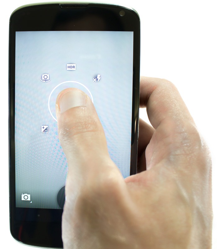
The Camera app got an overhaul in Android 4.2. Most of the UI has been swept under the rug so that you can see as much image as possible. Holding your finger down anywhere on the screen will reveal the new settings interface, which you should be familiar with if you've ever used the "quick controls" in the old Android browser.

The settings always appear centered under your thumb. To select something, just slide your finger over to an option, and release over what you want.
This new method of accessing the camera controls is kind-of... bad. The inspiration for it is obviously quick controls from the old stock browser, but those were a half-circle, and that's an important distinction that the people designing this UI didn't consider.
Pop Quiz: In the picture to the right, there are 6 options in this circle, which 2 are my thumb obscuring? The browser's half-circle layout gave your finger a place to be - the other, empty half of the circle. The camera controls are a full circle though, which means your finger is always obscuring 1 or more options. I guess once you memorize every option, you'll be able to fly though the camera settings, but every time I try to use it I find myself tilting the phone so I can look around my finger.
Thankfully, Google has provided a way to skip the quick control scheme. Just tap the circle in the lower right corner and the circle UI will open in "tap" mode - you can use it like any other piece of UI. Problem solved.
If you noticed digital zoom isn't included in the circle menu, good for you! Use pinch zoom.
The button in the lower left switches camera modes. There's the usual camera, camcorder, and panorama, and a new entry, "Photo Sphere." I'll talk about that later.
The lower right circle, besides bringing up the UI in "tap mode," is also a settings status indicator. In the second picture, you can see I've got flash enabled and +2 exposure (not recommended settings). The circle is where the thumbnail used to be in older versions of the camera app, so now that it's gone, how do you get into the Gallery? Easy! Just swipe to the left and you're there. The camera viewfinder is just another picture in your filmstrip. This was introduced in 4.1, but in 4.2, the thumbnail is gone, so now it's mandatory.
I'm disappointed that the decided to change the camera UI without fixing the biggest problem I have with all camera UIs: It is often really hard to hit the camera button. Try taking a self-shot with the rear sensor, or take a one-handed horizontal picture. It's really awkward. I wish they would let me double tap, or long press anywhere on the screen to take a picture. Having the camera settings always be under your thumb is a nice idea, but I don't need to change the camera settings that often, what I need to do is hit the shutter button. Make that easier.
The crazy new party piece in Android 4.2 is "Photo Sphere." Google has managed to condense a Street View Car down to the size of your phone! Just imagine taking a panorama with several pictures, but in a giant circle. It's not a fast process; taking a full 360 shot will require about 10 pictures, and if you want to add some vertical height, expect to take about 20.
The interface for this is fantastic. The phone shows you a 3D "room" that is responsive to the accelerometers in your phone. Take a picture and move the camera in any direction you want to extend the picture in. A blue dot will appear to tell you how much overlap is needed. Center on it and the phone will automatically take another picture. Just repeat this process until you're satisfied with the scope of your photo, hit stop, and pray Google's magic algorithm doesn't mangle your picture.
How well does it work? Well... it's new. I've yet to get an indoor shot that didn't have a flaw in it somewhere. Lamps get cut in half, door frames don't line up, and if there is something moving in your picture, forget about it. Even though the pictures to have a few flaws in them, they're still seriously impressive.
Google says the spheres are just plain JPGs with some 'wrapping' metadata. You can even pull the JPGs off your phone and view a crazy, flat version of your sphere. It's really trippy looking. They did a fantastic job with portability. All the data is contained in the JPG, so you can download the file or email it to someone and it will still be a sphere. Google+ supports them, too. The only problem is that there's no way to stick them in a web page. Your best bet is to check out #photosphere on G+.
Photoshop is currently out of the question. Trying to edit your flat photo will break the metadata and it will be flat forever. It's a shame too; Photoshop would be nice for cleaning up the bad merges.
Keyboard
Remember Swype - that crazy, perpetually-in-beta keyboard that let you slide your fingers across it to spell things? Google's got their own version now, and I like it better for one big reason: The autocorrect is a lot better. I've always felt like you needed to be a perfect speller to use Swype, which is understandable - your swoopy finger trail is already ambiguous enough, add in an incorrect swoopy finger trail and everything gets a lot muddier. Somehow, though, this keyboard just manages to deal with it. I can skip letters, or accidentally add letters and try to "correct" it with my finger trail, and it all just kind-of works. It's great.
This keyboard is great at everything, so feel free to mix it up. Swipe one word, tap out another, add another with your voice, it's good at whatever you feel like doing.
Here's a scary concept: the swiping part of the keyboard is multi-touch aware, which means, if you are some kind of typing phenom, you could potentially swipe with 2 fingers at once. Good luck with that.
Battery Life
The old Nexus had an absolutely atrocious battery life. Upgraders will be glad to know the Nexus 4 lasts a lot longer. I usually get about 16-18 hours out of the battery with medium use. The battery charges from dead to full in about 2-3 hours. forgot to take a screenshot of the full graph at the end of the day, so the picture on the right is from earlier the same day, about 1 and a half hours before it died.
For this run, I had auto brightness on all day, streamed Pandora over bluetooth for about an hour while driving to and from work, took a phone call and some texts, and had about a 50/50 split between Wi-Fi and cell data time. GPS, Sync, and Bluetooth were on the whole time, as were all my normal apps like Facebook and Lightflow. I just used my phone like normal.
The other important power consideration for this phone is that, with an accessory (Price TBD, although it is compatible with the Qi charging standard), it is capable of wireless charging. The phone has an induction coil embedded in the back of it, so all you have to so it place it on its little charging orb and you're done. When charging is this easy, you'll probably charge it a lot more often.
Conclusion
There are so many important things going on here. This phone will be sold primarily online and unlocked, out of reach of the monopolistic, innovation-stifling carriers. You're free to switch providers as you please, get your updates as soon as they're out, and you can install any apps you want. It's a Nexus, so root will be easily attained, too.
This is also the first phone to combine a real passion for design and materials with high-end components. This is a premium, high quality device in every category. In my opinion, Android's biggest weakness right now is that all the phones just feel so cheap. I really hope other manufacturers take note of the premium feel of the Nexus 4 and step up.
The real mind-blower is that this is unlocked for $350. It feels more expensive than every other high-end phone at half the price. That is completely insane. I think I should just give up reviewing phones now, because I don't see how I will ever be able to hold anything up to this and say "yes, this other phone is competitive." The bar has been raised, everyone. Please don't send me anymore $600 plastic bricks. Compete with this or go home.
Normally a Nexus device is worthy of your consideration just for the software, but this is the first Nexus where the hardware is also a huge selling point. It so thoroughly, completely outclasses every other phone design, it's kind of embarrassing.
The best-looking, best-feeling, most powerful Android phone is a Nexus. How can anyone say no to that? I'm not giving this review unit back until my personal one arrives.