Quick Links
I panned the Note 10.1 in my review. It was subtitled "An Embarrassing, Lazy, Arrogant Money Grab" and, for my conclusion, I took a picture of it in a trashcan. I did not like it. It had erratic performance, a squishy, creaky back, and a bunch of gimmicky features that didn't work. Now, I've got a Note II!
I'm happy to report the Note II is not as crappy as its bigger brother. It's much more solidly built in comparison, really fast, and god help me, some of the TouchWiz features are actually good. They greatly improved the split screen app feature of the Note 10.1, and I think Samsung has finally found their huge, differentiating software feature that they've been searching for.
Of course, I am practically required to mention that the Note II is freaking HUGE, which I am totally fine with. How "fine" you are with it is entirely going to depend how large your hands are, how important a phone is to you, and the size of your pockets. The only way to determine that is, honestly, to try one for yourself.
I've gotten to play with an international Note II as well as the T-Mobile version, and here's where the craziness comes in: they have totally different features. The international Note II has split screen multitasking, and the T-Mobile one does not. I've seen YouTube videos of a built-in screen recorder (which would have been really handy for this review), and it's completely MIA from both of my phones. These are serious, headlining features that are just missing. I'm going to write this review assuming eventually everything gets fixed via OTAs at some point, but if you're thinking of getting a Note II, make sure the version you're getting has the features you want, because right now, the T-Mobile version is missing the Note's best one!
Specifications
- 1.6GHz Quad-Core Exynos 4412
- Mali-400MP GPU
- 2GB RAM
- 16/32/64 GB ROM (partitioned as unified storage) with microSDHC slot
- 5.5 inch, 1280x720 Super AMOLED Display with new sub-pixel layout
- 3100 mAh Removable Battery
- 8 MP Rear Camera, 1.9MP Front Camera
- WiFi A/B/G/N
- Bluetooth 4.0
- USB 2.0 Host, MHL
- Dimensions: 151.1 x 80.5 x 9.4mm
- Weight: 182.5g
- Android 4.1.1 (Jelly Bean!) with TouchWiz
The Good
- This split screen implementation is amazing. It may have a very limited app selection, but that selection now includes the useful Google apps that I use every day. Split screen Gmail, Chrome, Talk, and YouTube is multitasking nirvana. This will change the way you use your phone.
- A much more appealing, more rectangular design that ditches the blob-like exterior of the GSIII. The top and bottom bezels are a lot slimmer than they are on the GSIII, and the gray, seam-filled, brushed faux-aluminum rim has been ditched for a faux-chrome rim. I like it. I wish it came in black.
- An awesome 8MP camera that takes seriously pretty pictures. The built-in burst mode (just hold down the button) is handy, too.
- A 3100mAh battery. This will last you the entire day, the entire night, and usually a bit into the next day. There's really no secret to it, a really big phone can pack a really big battery. This is the one of the few phones that shouldn't have MAXX envy.
The Bad
- Cheap-feeling, glossy, slippery plastic. I feel like a broken record here, but this is particularly damaging (literally) for the Note II. It is big enough that your grip isn't as encompassing as it is on a smaller phone, so you are much more likely to drop it. The back is about as slick to the touch as the screen is, which isn't good. Something grippier is really needed for devices this large.
- The hardware buttons. The S-Pen can't activate Menu and Back, and pressing the mechanical Home button with it is very awkward. You would think they would design the phone to work with its special input device. They didn't.
- The keyboard. Space bar doesn't insert the current auto correct suggestion, so unless you go out of your way to tap the prediction bar, there's no autocorrect.
- TouchWiz is ugly, gimmicky, confusing, poorly thought out, and now, really bloated. Everything has a million features, a million checkboxes and switches, and a million menu items. Samsung has taken the "throw everything to the wall and see what sticks" strategy in regards to software development, but they never retire the crappy ideas, which are most of their ideas.
Hardware
Design & Materials

Imagine if you took a Galaxy S III, kicked all the lawyers out of the room, and undid all of the changes they made to put legal space between it and the iPhone. I guess they felt confident enough with the S-Pen and the massive size difference to throw out the Apple trade dress rulebook and design a phone logically.
The Note II ditches the GSIII's amorphous, blob-like design and goes for a rectangle with rounded corners. The ugly, seam-filled faux-brushed aluminum was replaced with a much better looking faux-chrome ring, and the top and bottom bezels were shrunk down. The result is a decently attractive device.
The back is also better looking than the GSIII. The chrome ring extends around the back enough that it completely covers the corners, leaving the battery cover as a much flatter, normal-looking backing. It really cuts down on the "endless ocean of plastic" look the GSIII has going on.
Sadly, the Note II is still plastic. It's built with Samsung's now-standard cheap-feeling, glossy plastic, and no matter how many times they shove this crap out the door, I still won't find it acceptable. Samsung is dead last when it comes to materials: Apple builds everything out of glass and aluminum, the same goes for Asus's high-end stuff, HTC uses milled unibody polycarbonate, and even Motorola's budget phone is made with an aluminum frame and a Kevlar back. The RAZR M blows this thing away, and you could buy 3 of them (on contract) for the price of a Note II.
The plastic back is about as slick as the Gorilla Glass screen, a surface that is made to be a slippery as possible, so that you can smoothly glide your fingers across it. I actually think that's what they're going for - they want the screen and back to feel like the same material.
The huge problem with that idea is that I need to hold this, so, news flash Samsung, slickness is bad. The slipperiness on the Note II is especially problematic - because it is so huge. Your grip isn't as encompassing as it is on smaller phones. Your fingers don't get as much "wrap-around" as they normally would, and many people will have to adjust their grip from the bottom to the middle, so that they can reach every part of the screen. I've had a lot of friends I show it to say "I feel like I'm going to drop this" because the size and slickness makes for a really bad combination. As opposed something like the Nexus 7, which has a grippy back because Google and Asus understand you're more likely to drop a bigger, one handed device.


Samsung has been nice enough to include an RGB notification LED. The regular software will only show about 3 colors, but something like Light Flow will unlock the whole LED rainbow. It's always cool of OEMs to include these when 99% of customers won't take advantage of it. It's like an enthusiast-only hardware feature.
The back cover peels off just like a GSIII, which reveals a MicroSD slot, SIM slot, and a huge, 3100mAh removable battery. The back cover is held on with tiny plastic tabs, which look like they'll break off after a week, but the same design on my Galaxy Nexus has been standing up to my abuse for a year.
Hardware Buttons Vs. The S-Pen
I hate these hardware buttons. Not because hardware buttons are old, lame, and inflexible, which they are, but because they will be one of the most used parts of the device, and Samsung managed to screwed up every possible aspect of them.
For starters, they're backward. Google, HTC, Motorola, LG, Asus, Acer, and even Apple all put their Back buttons on the left - probably because the button points left. The back button in a browser is always on the left too. We read left to right; left is where we used to be. It just makes sense: left is back. The back button should go on the left.
Samsung insists on putting Back on the right - in a different spot from everyone else and everything else. They're also invisible when they aren't lit up, so if you aren't used to this crazy layout, you're going to want to go to display settings and set them to "always on."
Second, I'm supposed to use this thing with the S-Pen, right? Then why is there a hardware home button? Pressing a slippery, plastic button with a slippery, plastic pen is incredibly awkward. The amount of force you need to impart through the pen and into the button really unpleasant and clunky. The Note 10.1 has software buttons, which meant one quick tap and you were on your way. Having to hit the home button is a huge speed bump in your workflow.
Even worse than the difficult to press home button are the capacitive Menu and Back buttons - they do not work with the S-Pen at all. I don't mean they work poorly, or that they are hard to use with the S-Pen, I mean tapping on them does absolutely nothing. The special S-Pen-aware touch surface does not extend to the button area, so the buttons cannot be activated with the S-Pen. Samsung implemented a clunky pen gesture for Menu and Back, but that's still much slower and more difficult that just tapping a button.
This is just a jaw-dropping oversight. On the Note 10.1, with its software buttons, you can easily zip around from app to app with the S-Pen, on the Note II, it is slow, awkward, and annoying. I never casually use the S-Pen because it is just so unpleasant to navigate the OS with it.
Samsung was supposed to design a phone that revolved around pen input. In their zeal to recycle the Galaxy S III design, they completely and utterly failed at that job.
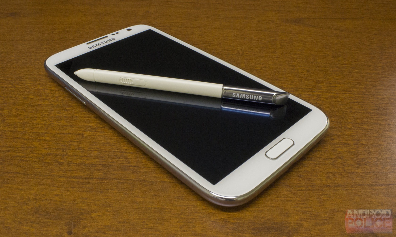
As for the S-Pen itself, it works about as well as it did on the Note 10.1. It doesn't really feel necessary, and app compatibility for it is extremely limited. It mostly just works as an old-school Palm stylus. Samsung claims the pen supports 1000 levels of pressure sensitivity, but S-Note, the primary pen app, seems like it only supports about 5. 1000 levels of sensitivity to decide if you want an 8 pixel line or a 13 pixel line is just a bit of overkill.
Screen
The screen is not Pentile, but it doesn't have a traditional sub-pixel layout, either. I've yet to hear a definitive name for it, Samsung just calls it "HD Super AMOLED." So if it's not Pentile, and it's not a normal RGB stripe, what exactly is it?
It's this:
A normal RGB stripe layout is a row of red, green, and blue sub-pixels, but this has a tall blue sub-pixel, and the red and green sub-pixels stacked on top of each other! If you'd like to see a giant, 5MB version of this picture, click here.
In person, it looks great. Pentile's trademark checkerboarding is gone, and you can clearly see you're getting more sub-pixels on this than you would normally get on a typical Samsung AMOLED. Everything is smoother and crisper than a GSIII or Galaxy Nexus. The only flaw I've found is that some edges don't quite look right. The Play Store icon, for instance, has a pink line at the bottom. Which makes sense given the pixel layout. It's barely noticeable though.
Performance
With Samsung really pushing the multitasking envelope, all this extra processing horsepower suddenly has a lot to do. Now that you can actually have a video open while you surf the internet, you'd better make sure the processor can manage all that.
The 1.6GHz Exynos will easily handle a single app, and will plow through your dual app workload pretty easily, too. And all with none of the weird slowdown stuff that was plaguing the Note 10.1. This processor is seriously fast, and, even in split screen, will handle whatever you throw at it.
Camera
The Note II takes awesome pictures. See for yourself:
Everything I took with it can out crisp and clear, I'd easily use this as my main point and shoot.
The Camera app itself is fully featured. Look at this menu:
Isn't this seriously overboard for the normal "Point and Shoot" types that will be using this? I would like to see at least some sort of "basic" or "auto" mode, or at least some decent defaults. Shouldn't "Auto contrast" and "Anti-shake" be on by default? They aren't.
One of the new features is "Take photo using voice," which is a cool little solution instead of a self timer. The thing is, when would a self timer be useful? I pretty sure you can't buy a Note II camera tripod or anything. I guess you would have to prop it up with whatever you have lying around.
TouchWiz
So, TouchWiz, we meet again.
Things are starting to get crazy. It seems like this build of TouchWiz started with the Galaxy S III, which was already packed with awkwardly-branded gimmicks features. They added to that with the Note 10.1, and now, they've added to that with the Note II. It's just features on top of features on top of features. Attempting to cover it all is a daunting task.
Like I said, this version of TouchWiz shares a lot of DNA with the other current Samsung devices. The lock screen, home screen, Calendar, Contacts, Phone and S Voice are pretty much identical to the GSIII. So if you're interested in reading about them, check out the software portion of my GSIII review. I'm just going to cover the new stuff, and this section will still be ridiculously long. I promise. We'll start with the big one:
Multiscreen (Split Screen)
Split screen apps from the Note 10.1 are back! This time though, the apps are actually useful. On the Note 10.1, you were stuck with a crappy email client, a crappy IM client, an old browser, and a local-files-only video player. On the Note II, you get Gmail, Talk, Chrome, and YouTube! And that's not all, the lag when switching between apps has been reduced to zero. The combination of 'the apps I want' plus a touch response that is now on par with the rest of the system makes for a night and day difference. In my opinion, this is the defining, killer feature of this phone. Split screen is awesome, and Google needs to get this folded into Android and working for all apps right now.
Limits
There are still limitations, though. You can only use certain, pre-installed apps (though developers can add support for their own apps pretty easily). The pre-installed apps are good this time, though. The full lineup is pictured in the first screen: ChatON, Email, Internet, Video Player, Messaging, S Note, Gallery, Gmail, Chrome, Maps, Talk, and YouTube. You can also only have 1 copy of each app open, so messaging two people at once, or seeing two web pages side-by-side in Chrome is out of the question (though you could use Chrome and the old browser).
These apps just happen to be most of the ones I want, so I'm happy. I would like a few others, though. Of course, Google Voice won't work with it, neither will Google Reader, and it's notably missing any kind of word processor. Docs would have been nice, as my number one multitasking use case on a computer is internet + word processor.
How It Works
The interface is easy enough. There's a small, circular tab on the side of the screen, tap it and a scrollable tray will pop up. From here, grab the icon you want, and drag it out to the top or bottom half of the screen, and you're done! The little app tab is even movable. Dragging it around when the tray is open will move it to a different side of the screen, and dragging it when the tray is closed will allow you to change the spot the tab sits at (it doesn't have to be centered). So if you want the tab in the top-right corner, you can do that.
The only crazy thing is how you call and dismiss the tab itself. Suppose the tab is not on your screen anymore, and you want to bring it up, go ahead and take a guess as to how you do that. A swipe in from the side of the screen? That would be the most logical, but no. A shortcut, option, or notification that turns split screen mode on? Nope. In fact, there isn't a single bit of text about split screen on the phone. You have to long press the back button. I had to Google that one.
Other than the crazy way to open the app tab, this all works so well. The windows are split with a draggable barrier, so you can adjust the size of the windows. When you tap on the bar, 2 black window management buttons pop up. The first one will swap the top and bottom apps, and the second will maximize the bottom app (or close the top app, however you want to look at it). For some reason, you aren't allowed to maximize the top app.
I tried very hard to break this, and it deals with everything extremely well. Popup lists, like for Gmail's navigation, will correctly overlap everything and even stick out of their 'half' if they need to, the Back and Menu buttons only affect the app you last touched, and landscape even works. It's polished enough to seem like a native feature of Android.
Typing
Typing in split screen sounds like a mess, but it actually works very well. Just tap on a text field and a draggable keyboard will popup, if you tap anywhere else, the keyboard closes. Rather than try and be smart about it, the draggable keyboard lets you stick it where ever it will work. I like it.
For some reason, the keyboard shrinks in split screen mode, which I really don't get. The 50 or so pixels to the left and right of the smaller keyboard aren't useable, so I'm really not sure why they made it smaller and harder to type on. For instance, in the first picture, it's not like I'm currently making use of the Gallery. Having smaller keys so I can see the left, right, and top edges of my pictures isn't benefiting me or anything. Typing on it isn't awful, but typing on the full sized keyboard is much easier.

Typing in landscape while using split screen is just impossible. Do not attempt this.
Recent Apps Compatibility
Recent Apps has no idea what is going on when you do split screen. First, the good news: they did fix one bug from the Note 10.1 implementation - Recent Apps no long shows open split screen apps, which you can see in the second picture. The Note 10.1 would have displayed Gmail or Chrome while they were open, which is wrong.
As for the broken stuff, when you leave a split screen pair, the Recent Apps list makes no indication that they are in split screen mode. In the 3rd picture, tapping on Chrome or Gmail will bring up the same screen, but Recent Apps doesn't indicate this.
What will happen when you switch apps while in the split screen mode is impossible to remember. If the app you're switching to has previously been opened in split screen, it will replace the last split screen app you've interacted with. If it hasn't been opened in split screen lately, it will be a full screen app. So check out those Recent Apps pictures above and tell me which ones have been opened in split screen and which ones haven't. Good luck.
Conclusion
Aside from the Recent Apps confusion, Split screen mode just works. I love it - it's the best feature of this phone. My favorite thing to do is start a YouTube music video and shrink it down as much as possible (see it at the bottom?), then I can almost realize my dream of a multitasking friendly, backgroundable YouTube app. You can watch a video, pop out to answer a text message, and your video never even stops. Remember, Samsung isn't allowed to mess with the Google Apps. When you consider that, it's amazing how well everything just deals with this. Split screen is beautiful and I want it on stock Android with 3rd party app support.
Notification Panel
Not much has changed in the Notification Panel. They added 2 new items, AllShare Cast (DLNA), and "Blocking Mode," which is basically a selective notification mode. This is probably the 4th or 5th version of TouchWiz, and Samsung still hasn't made the controls customizable.
Gallery
Samsung makes a big deal out of the new Gallery, so I guess I should, too. Tapping on an album brings up a tablet UI! That's new. It pretty much works like every other Gallery. It's different, but very usable.
Long pressing on a picture will bring up a checkbox selection interface, like normal, but Samsung added dragging support to it. So, to move pictures, you can check whatever you want, drag it to another album, and you're done. When you drag, you pick the pictures up in a stack. The faster you move your finger, the further away the stack will lag. It's really cool.
The button in the top right will activate "crazy photo view" mode. The first is just scrolling picture rows, which seems a little gratuitous, but I can deal with it. The second one is a completely insane "swirling photo vortex" which exists for no reason other than to give a whiz-bang demo. Samsung has a quad core processor and they aren't afraid to use it!
"Photo Note" is an attempt to replicate notation on the back of a paper picture. Hit menu, pick Photo Note, and it will flip the image around, make it transparent, and then you can draw on it. It also plasters a "Galaxy Digital photo" watermark over your picture. Afterwards, the top right corner of the photo will appear folded over, and you can tap that and see your note. The photo and the note, however aren't attached in any way, which kind of defeats the purpose of writing something on the back of a picture. If you share the photo, the note doesn't go with it.
Feature Overload
If you're the type of crazy person that says things like "stock is boring and has no features," boy will you be in love with this thing. Just to give you an idea of the scope we are dealing with, here's a (probably incomplete) list of features from various Samsung press releases.
- Smart Stay
- Smart Rotation
- Smart Alert
- S-Voice
- Social Tag
- S-Beam
- Group Cast
- AllShare Cast
- AllShare Play
- Popup Play
- Popup Browser
- Popup Note
- Photo Note
- Best Photo
- Buddy Photo Share
- Page Buddy
- ShareShot
- Direct Call
- Quick Glance
- Quick Command
- Palm Swipe Capture
- Palm Touch Mute Pause
- Turn Over To Mute
- Tilt to Zoom
- Tap to top
- Multi-Screen
- Air View
- Easy Mode
- Easy Clip
- Blocking Mode
- Shake to update
- One Handed Operation
If you don't know what half of these do off the top of your head, neither do I. This doesn't even include the actual applications - this is mostly just stuff that's built into the OS. It's an insane amount to keep track of. Don't worry though, here comes a run-through of most of them. I hope you packed a lunch. And some Advil.
Smart Stay and Smart Rotation
Smart Stay and Smart Rotation are indicated by the in no way creepy Lens of Truth eyeball icon in the status bar. They both use the front facing camera to try and figure out if and how you're looking at the screen. Smart Stay will keep the screen on; Smart Rotate will rotate the screen to match your face. Smart Stay works great, so if you're the type of person that has a really short screen timeout, you'll like this.
Smart Rotate works, you can lay down and have the screen stay in portrait, but it will add about a second of lag to the rotate change. I usually keep auto rotate off, because I cannot stand how slow rotating is, so I'm going to keep doing that.
Smart Alert
If you've got a text message or missed call, the phone will vibrate when you move it. That happens. There's also a notification light, though, so I'm not so sure this was really needed.
Social Tag
So the gallery has facial recognition, and if you take the time to tag a few of your contacts, it will eventually learn who's who and will start tagging them automatically. You can then call your friends from the Gallery. I have no idea why you would want to do this.
S-Beam
S-Beam is Samsung's proprietary mashup of NFC and Wi-Fi Direct to transfer local Music, Pictures, and Video to another Samsung Device. The only products that are compatible right now are other Note IIs and the GSIII. The Note 10.1 is not compatible because Samsung neglected to include an NFC chip. So even if you are all Noted-out with the 10.1 and the II, you won't be transferring files. That would have probably been the most likely use case for something like this.
As for sharing with other people, S-Beam is the product of completely backwards thinking. No one wants to transfer local files. Stuff is sent over the internet now. Sneakernet has been dead for a while.
Group Cast
Group Cast will let you screen share a picture, music, or document to anyone on the same Wi-Fi network. You have to start a Group Cast and create a pin, then the other people have to join the Group Cast and enter that pin. Then they see the same picture, document or song that you do, and you can all draw on the screen and everyone will see it.
Samsung PR pitches this as useful for business meetings. So rather than just set up a projector and put the presentation on that, it's "Let's spend the next 10 minutes messing around with the settings on our Samsung Galaxy Note® IIs!" This would also require everyone in the meeting to have a brand new Samsung phone.
AllShare Cast
This is real, working wireless screen mirroring to your television. You need to buy a dongle though.
AllShare Play
AllShare Play is basically DLNA that also works across the internet. I actually have a new Samsung TV that supports this, and sure, after a significant amount of setup, you can make your TV display your pictures, music, and video. And that's your videos only - codec support is so non-existent that I couldn't get anything other than videos from the camera to play.
Popup Play, Browser, and Note
Popup Play, Popup Browser, and Popup Note are all floating windows that you can use in addition to the split screen stuff. Popup Play is a local video player, you can resize it with pinch zoom, tap to pause, and, like the other two windows, you can drag it around.
These features all seem related, but opening them is a complete mess. Popup Play is a button in the video player, that's nice and easy and obvious. Popup Note can only be opened with a pen gesture, and Popup Browser is only able to be opened by tapping on a link and choosing Popup Browser from the App Picker. Having 3 different ways to open similar programs is really confusing. The Popup Browser, however, takes the cake as the stupidest possible implementation. If you want to use it, you can never set a default browser. Popup browser relies on the App Picker, which won't pop up if you have a default browser set. And remember, this is the new Jelly Bean App Picker, which is specifically designed to slow you down. I'll never use Popup Browser because of how difficult it is to open, and how not having a default browser makes opening every link a 3-tap affair.
Page Buddy
Page buddy is a set of specialized home screen pages that open when a certain trigger event happens. Those events are removing the S-Pen, plugging in headphones, docking the phone, or when you walk into a cellular roaming area. The idea is that you fill each specialized page with the appropriate apps, and when you take the Pen out, for instance, the screen pops up and you have all the apps you want at your fingertips.
...Why do these pages look like advertisements? "Discover you inner creativity?" Really? The text and the yellow corner design make these look like a sign you'd see in an electronics store. I don't need promotional slogans shouted at me in bright yellow every time I plug a pair of headphones in.
You can customize the middle of this screen with widgets and icons - it's a 3x3 grid. The slogan is permanent, though, and the apps at the bottom are "recommended apps" for your current activity, which you also can't change. For some reason, it is recommending I use Calculator, Weather Eye, and Chrome when I pull out the S-Pen, but they have no S-Pen functionality.
Best Photo
Best Photo is a burst mode that will only save the pictures you select. It's a separate camera mode. With the Note II, a regular burst mode is built into the standard camera mode now, so this just seems obsolete.
ShareShot
This is the much-advertised feature that will send all your pictures to other Note II or Galaxy S III owners on the same Wi-Fi network who have also joined your ShareShot group. It must be awesome at Samsung's corporate parties.
The Google+ app will do this for everyone with an Android phone. If this idea really appeals to you, the wider compatibility makes the G+ version much more valuable. Really though, you'd want to curate and approve your photos before sending them to everyone, wouldn't you?
Quick Glance
Quick glance is an ironically named feature that will turn the screen on when you wave your hand over the sensor cluster. It loads a special screen which displays the time, date, battery, and missed calls and texts. The problem is, there is nothing quick about it. It takes about 2 - 3 seconds to turn on. If this is supposed to be the smartphone equivalent of glancing at a watch, Samsung, you failed. This is so slow, it's useless.
Quick Command
Whip out your S-Pen, hold down the pen button, draw a straight line up on the screen, and you'll bring up the "Quick Command" screen. Quick Command is a programmable, handwriting recognition-based launcher, which can sometimes even pass text to the app your launching. For instance, write a question mark followed by a search term, and it will do a Google search. The other default commands are listed on the right picture.
I said "default" commands, which means, yes, you can actually make your own. Tapping the "Add a command" button will ask you if you want to trigger an application or a function (think power control stuff). After you pick what you want to do, you'll have a grey writing area where you can choose your command trigger. I immediately tried to do something cute, like have a music note trigger the music app, but it can only be one of the recognized symbols in picture #4, or a letter. Most non-Samsung apps can only be launched, but there are a few exceptions, like Gmail, which will let you pass the text on to a particular field, like the recipient or body.
It all works, but it's not an ultra-quick revolution in how you use your smartphone or anything. It's yet another feature that requires you to have a perfect diagram of how it works in your head in order to use it. "What was the symbol for Texting again?" ... "Oh. Right. Tilde."
Palm Swipe Capture
This is for taking a screenshot. Wipe your palm across the screen while it is on, and TouchWiz will take a screenshot of the ensuing chaos. This almost always triggers a false touch response and screws up what you wanted to take a screenshot of. Remember this: Power + Home. That will take a screenshot the proper way.
Air View
Air View replicates mouse hovering on a touchscreen device. The Note II can detect the S-Pen from a few cm away, so you can hold the pen above the screen and have a "mouse cursor" of sorts. Android doesn't recognize a hover event, but Samsung has built one or two things into their own apps. Hovering over an album in the Gallery will give you a preview of it, hovering on the video timeline will give you a preview thumbnail, and hovering on a calendar event will give you an expanded preview. You can also navigate Flash based menus in the browser.
One Handed Operation
This one is hilarious. Samsung knows their phone is huge, perhaps too huge for some people, so they came up with "One-handed operation" which will use smaller, right or left aligned versions of the keyboard, dialpad, etc. I just think it's really odd looking. If you need this, you probably shouldn't have purchased the Note II. Try a RAZR M.
Miles of Menus
Samsung still included a menu button, and still thinks hiding a million options under it is ok. The menus have scrollbars - it's like a user interface designer's worst nightmare. Who decided 17 menu items for a picture was a good idea? Cut some of this stuff down, use a hierarchical navigation if you really need that many options. You're telling me "Draw on image," "Crop," "Advanced Edit," "Rename," and "Edit weather tag" couldn't go under a single button called "Edit"? No one can find anything in this mess. It's scary.
All The Wrong Tutorials
Did you know you can swipe on the lock screen to unlock it? Or that you can tap on the all apps button to see your apps? Or that you drag down to see your notifications? Did you know about this feature? Or this feature? OR THIS FEATURE!? There needs to be a "shut up" button that turns all this crap off. Better yet, just ask, once, when the phone turns on if you would like to be in tutorial mode. This is crazy, and there is no way to disable everything.
Some screens even have multiple popups. So when you turn your phone on, lock screen tutorial #1 comes on, and you tap "Don't show again" and mash OK, but then the next time you turn on your phone, it shows tutorial #2! For the first day or so, using this phone feels like browsing the web before pop-up blockers were invented. Not a good first impression.
The worst thing is that this is "advanced" mode. There is actually an "easy" mode that lowers TouchWiz's assumptions about your intelligence even more.
This is easy mode. Which I really have no problem with, but put all those stupid popups here. Give the rest of us an option to turn that crap off. I guarantee you the majority of customers will not be popping their smartphone cherry with the Note II.
The sad thing is that some features of TouchWiz are bafflingly unintuitive, and that stuff never gets explained. So far I've had to resort to Google to figure out how to enable split screen (long press the back button), screen recording (Home + Volume up, which doesn't work), and screenshot (Home + Power, it's normally Power + Volume up). There is even a "Help" app, and none of this is explained there, either. Letting me know that I can tap on the "apps" button to see my apps was helpful though, thanks.
Keyboard
Samsung still can't get the keyboard right. The GSIII would do a crazy, in-line word prediction thing, where typing "A n d r" would make "Andre" appear in your text field, because that's what it thinks you want to type. Displaying letters you haven't typed in the text field made it basically unusable. The Note II goes in the complete opposite direction, and does no auto correct at all, unless you specifically go out of your way and tap on the prediction bar. Yes, that's right; it will not change what you've typed in any way if you hit the space bar. If you want to type "work" and accidentally enter "w o r j [space]" you will end up with "worj."
As a result, this keyboard sucks. There is no option make the spacebar insert a prediction. Every typo is dutifully preserved. You don't get any help at all. They also broke Jelly Bean's spell check, so you don't get the MS Word-style red underlined words. I'm not sure why you would want to remove such an awesome and useful feature, but they did.
You can also switch to a handwriting recognition "keyboard" by long pressing on the microphone, and you can even set it to pop up when you pull the pen out. Give me a handheld computer and a pen and I am immediate going to start banging out text in Graffiti, but, sadly, this doesn't support it.
Writing as opposed to typing is pretty slow, but then I've used a keyboard most of my life. Maybe older people will get a kick out of this whole "handwriting" thing. There isn't much auto correction here, either, so it makes a lot of stupid mistakes.
The other keyboard option is the Clipboard, which works just like a desktop clipboard, in that it is a list of all the stuff you've copied recently. Here it's showing a bunch of screenshots. You can't drag the screenshots out into Gmail as attachments or anything; you can only do that in S-Note.
Crapware
Here's the full app drawer for the T-Mobile version. You get the usual suite of Samsung ecosystem crapware, and about 5 T-Mobile apps. You can disable (but not uninstall) just about everything, even the carrier stuff. OEMs and carriers have the ability to turn off the disable button for apps, and they didn't. Thanks guys!
Battery Life
The 3100mAh battery does not disappoint. This battery will certainly last you a day, and usually through the night, and probably into the next day. There really isn't any trick to it, a device as large as this can fit a really big battery. This is what battery life should be like.
Conclusion
The hardware is, aesthetically, a huge improvement over the Galaxy S III. All of the ugly, design-around-the-iPhone decisions have been tossed out the door, and the result is a logically designed, rectangular device. The top and bottom bezels are impressively small, and they've even fixed the back. It's attractive.
The exterior is still made from the cheapest material Samsung could find. While some companies choose their materials for a premium or a pleasant feel, Samsung's only goal seems to be "put something between the electronics and the user so they don't get electrocuted." It's like they view the exterior as nothing other than a parts bucket. I really wish they would put some thought into it, especially for the $300 asking price. A $100 RAZR M feels more expensive.
It is unstoppably fast, though, and it needs to be, because you can do a lot more at once with this phone than you can with other phones. The screen, a new, non-Pentile AMOLED with the full complement of sub-pixels, is big and beautiful.
As for the size, I never found the phone to be too big. I'd be perfectly happy with something this size. Whether you can deal with it or not is a personal thing. It is a huge device - if you're on the fence about the size, the only thing to do is go to a store and try one.
The S-Pen works just as well as it does on the Note 10.1. It's pressure sensitive, and you can do handwriting with it, if that's something you're into. The incredibly poorly-thought-out hardware buttons really make the S-Pen a pain to use. The S-Pen can't activate the menu and back buttons, so you constantly have to shift your hand while navigating around. Alternatively, you can use some clunky gestures, which are significantly slower than single tap buttons. I just don't understand why one of the primary input devices is incompatible with the primary form of navigation. It just blows my mind.
Pictured above: TouchWiz's user interface inspiration.
As for TouchWiz, this is the first time I've played with an OEM skin that, honestly, needs some kind of instruction manual to keep track of all the stuff it does, and all the crazy, unintuitive ways you are supposed to activate something. Long pressing on back will open the multitasking tray, holding down the button on the S-Pen and double tapping will open a floating note pad, smacking the top of phone twice will make it scroll to the top of a list. It's all completely crazy, and for most things there is no visual indication that some little trick is possible. Samsung just piles features on top of features, most of which are gimmicky, poorly thought out, and accomplish nothing other than padding out a spec sheet.
Samsung badly needs a Matias Duarte - someone with some design chops who will take over, cut out all the crap, and focus on the good stuff. Because there is good stuff here. Split screen is the multitasking feature I've always wanted, and it works. You can have YouTube as your music player while you surf the web in Chrome, you can view Gmail while messaging someone on Google Talk, you can reply to a text message in the middle of a YouTube video, and not lose your spot or your buffer. It's beautiful, and in my opinion, the next great productivity boost for smartphones.
The S-Pen and huge screen are nice and all, but it's split screen, a feature that changes the way you use your phone, that is the real killer app here. Many aspects of the Note II are clunky or rough around the edges, but I still like it. A phone that brings you a step closer to the way you use a real computer is hard to argue with. Assuming split screen actually comes to the US versions, it alone is well worth the price of admission. It's just a shame you'll have to wade through all the crappy parts of TouchWiz to get to it.