
Movies by Flixster has a very interesting design history. The developers behind this app are usually among the first to adopt new Android design guidelines—they had a Honeycomb-style action bar back when the Xoom was the only Android tablet around—and today it got another new refresh. The good news is that now it looks better on the Nexus 7, as opposed to the broken mess it was before. Now, for the bad news.
It doesn't look very good. Not that it looks bad, mind you. But if you were worried that you'd just be using a bunch of giant phone apps with your shiny new Nexus, Flixster isn't going to do much to put you at ease. Don't get us wrong. The app is perfectly serviceable. You can still find showtimes, movie descriptions, reviews, and directions to theaters nearby. It just doesn't feel like a very efficient use of space. Which is a downer since Flixster was one of the first to show us what Android tablets could be. Now, though, take a look at Flixster compared to the IMDb app on a Nexus 7:


The IMDb app uses navigation buttons as part of the Action Bar, whereas Flixster rather bizarrely removed those elements. As you can see in the earlier screenshots, the Home, Box Office, etc. tabs have been moved from the actual Action Bar to a second navigation bar just below it. This leaves one of two functions in the action bar: Search, and either Share or Settings, depending on where you are in the app. If you're on a movie page, that navigation bar disappears entirely.
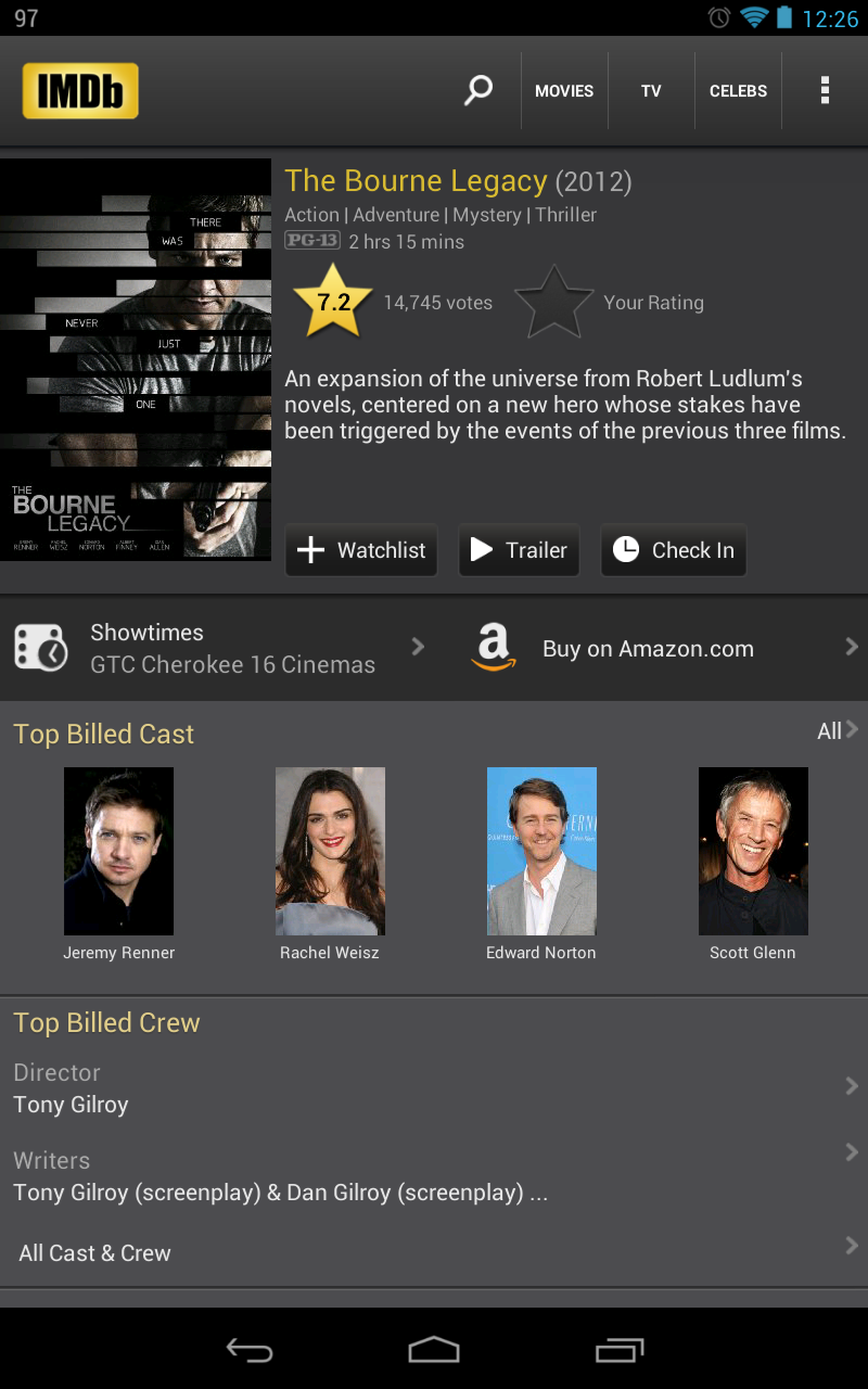
The IMDb app has a few other layout advantages. The Flixster app, for example, has a ton of extra whitespace. Whereas, IMDb includes the movie title, year, genre, ratings, a brief synopsis, options to watch the trailer or add to a watchlist, check showtimes and even search for the movie on Amazon before getting halfway down the page. Everything beneath that point, by the way, is scrollable. You can't tell from the screenshots, but it's a multi-pane layout in a single-column design. Which lends itself well to the landscape mode, which we'll get to later.
Meanwhile, on Flixster, most of the same information in IMDb's first panel is spread among nearly the entire page. It's simply an inefficient layout. The problem is, this column of information is designed to either be part of a phone UI, or a single panel in a multi-pane layout. This worked great on 10" Android tablets. Unfortunately, the pane-based layout didn't work quite so well when compressed to a seven-inch display:
Disclaimer: This shot was taken on the Galaxy Tab 2 7.0, though the layout looked identical on a Nexus 7.
While it didn't look too horrible here, it was a cramped layout. Also, take a look at the Action Bar. First, it requires horizontal scrolling, which is a huge no-no for navigation bars. Second, the names of the different sections are cut off. To be fair, this layout was designed for the original Xoom (and looked fantastic on that device, even in portrait mode), but it required an update. Unfortunately, the giant-phone approach isn't that much better. Particularly in landscape mode. Here's another IMDb comparison:
Okay, let's be fair: using a Nexus 7—or any other 7" tablet for that matter—in landscape mode is not a common use case. For the sake of completeness, however, one might expect a developer that has shown some aptitude for keeping up with UI trends to at least consider the idea. Here, however, Flixster has all but abandoned landscape mode, leaving over half the screen entirely empty. Meanwhile, the IMDb app has a multi-pane layout that's still scrollable. Kind of cramped, admittedly, but hey, if that's your preference, go for it.
It's tempting to look at Flixster's new app and say "It's fine." And it is! In fact, it does its job plenty well! However, with Matias Duarte running around telling people that developers need to start considering dynamic UI designs that look great on all types of devices, and IMDb providing an excellent example of how to do that (at least until you touch anything and get those annoying pop-ups for everything), it's difficult to say this new layout is designed for the Nexus 7. It's simply made to not be obviously broken on the Nexus 7.
Still, you'll probably enjoy it a bit more now than you did before. If you don't already have Flixster, grab it from the widget below.