
Quick Links
The Galaxy S III is a big deal. It's kind of hard to overstate it. Samsung is the biggest, baddest Android manufacturer out there, and this is their new flagship device for the next year.
Samsung is taking advantage of their newfound clout in the Android ecosystem: it's the first Android phone to escape the cellular carriers' meddling changes. Sammy managed to pulled off a unified launch across all the major US carriers - there will be no weird variants, and no names that sound like Street Fighter II sequels. It's just the "Galaxy S III." They are all the same, and you can get one on whatever carrier you want.
As a result, the SGIII will easily be the best selling Android phone this year. In fact, they've already sold 9 Million of them, and that was just preorders. Like I said: This phone is a big deal.
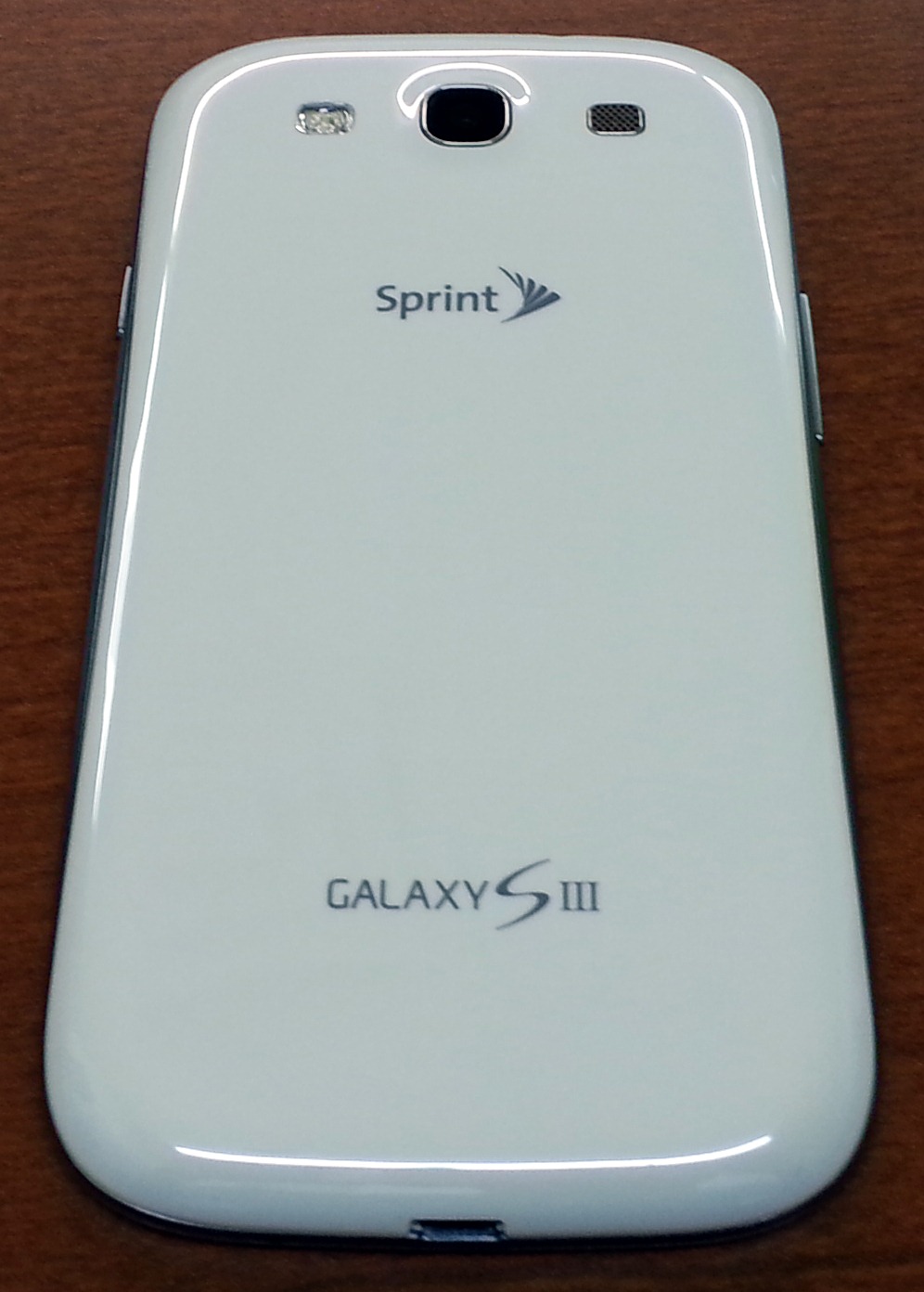
Samsung sent me the AT&T and Sprint versions (both white, boo) so I've mostly played with those. I have seen all 4 in person, though, and I can assure you that, other than the radio firmware, carrier crapware, and the logo on the back, they are all identical. So consider this review applicable to all US Galaxy S IIIs on all carriers (and some Canadian versions, too).
Spec time!
Specifications
- 1.5 GHz Dual-Core Qualcomm Snapdragon S4 CPU (MSM8960)
- Qualcomm Adreno 225 GPU
- 2GB Ram
- 16 or 32GB Rom (My 16GB was partitioned as 12.05GB of unified storage) With MicroSDHC slot
- 4.8 inch, 1280×720, Pentile AMOLED Display
- 2100 mAh Removable Battery
- 8MP Rear Camera, 1.9MP Front Camera
- A multicolor notification LED!
- WiFi A/B/G/N, Bluetooth 4.0
- NFC (Google Wallet is only for the Sprint version)
- Dimensions: 136.6 mm (5.38 in) × 70.7 mm (2.78 in) × 8.6 mm (0.34 in)
- Weight: 133 g (4.7 oz)
- Android 4.0.4 with TouchWiz
The Good
- Thin, light, and strong feeling.
- A multicolor notification LED! They fixed the biggest problem I had with the GSII.
- An awesome camera. It's good enough that I don't feel like I need a standalone camera. I wouldn't quite call it 8 megapixels though.
- A LOUD speaker. I don't think speakers this small can be good quality, or not be tinny, so all I ask is that they be loud, and this one delivers.
- Unified Storage. You don't have to mess with a separate apps/data partition.
- Great battery life and a removable battery.
- A MicroSD slot. These things are becoming endangered.
The Bad
- The Menu Button. It leads to poor discoverability in all apps (even ICS ones) by hiding the normal, on-screen options. Samsung also decided to have a mile-long menu list on every app. Menu negates one of ICS's biggest usability boosts and feels like stepping into the past.
- The phone body is 100% Glossy Plastic. When it comes to materials, Samsung is miles behind the competition.
- Touchwiz is still aesthetically challenged
The Meh
- The Screen. It's still Pentile. It's basically the same thing as the Galaxy Nexus display. It's not bad looking, but 6 months go by and Samsung can't come up with anything better? Pentile feels like a stop-gap solution.
Hardware
First off, the standard issue press images that everyone has been judging this on (me especially) is very unflattering. In person the side curve is almost imperceptible and the screen corners don't clash as badly with the device corners as they do in the press image. When seeing it in person, the design doesn't really inspire feelings in me either way. It reminds me of a GSII.
Design & Build Quality
Like I said, not really ugly, but not a jaw dropper either. A black option would go a long way. The black color on AMOLED screens is so black it just melts into a black bezel. On the Galaxy Nexus it's a beautiful combo, it's a shame it only comes in white and blue.
The front is top-to-bottom glass, interrupted only by the home button and earpiece. After that, I hope you like plastic, because the rest of this phone is all plastic. The back is plastic, under the back is more plastic, the ring around the phone is plastic with a painted-on "brushed" texture. Everything is plastic. Plastic with a high-gloss coating. HTC gives you the option of unibody aluminum or polycarbinate, and even Motorola is playing around with Kevlar backs. When it comes to materials, Samsung is just miles behind the competition.
Despite all the plastic, the phone feels pretty solid. It somehow manages to feel significantly thinner than my Galaxy Nexus, yet side by side there doesn't seem to be a huge difference. Its not as premium feeling as an aluminum unibody, but it's not terrible either.
I really love the earpiece. It's a chrome (chrome-ish?) little insert that sits almost flush with the phone, and has teeny, tiny little holes drilled in it. It's much better looking than the usual mesh earpiece. It's just really classy.
On the complete opposite end of the spectrum, we have this silver plastic band. It is covered in plastic seaming. There's a seam in the middle of the ring that runs around the entire perimeter of the phone, and it turns into a "T" seam in all the corners. So when this thing was being made in the factory, at some point the band was in 5 pieces. Crazy. The faux brushed aluminum look is obviously an attempt to hide this. It didn't work.


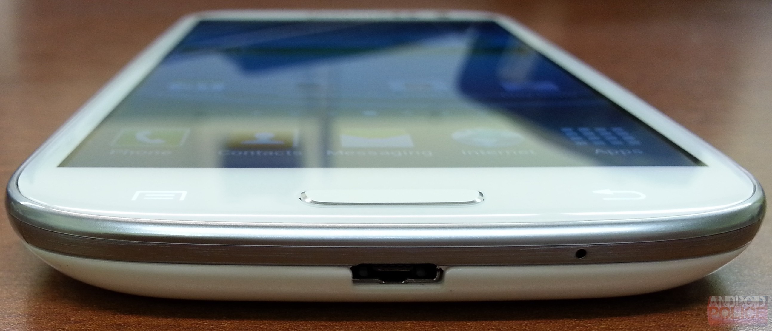
Along the top and bottom we have two microphones (for noise canceling and video recording) a headphone jack, and a USB port. The USB port sort-of supports MHL (An HDMI adapter). Standard ones won't work, you have to get a special, GSIII-only adapter.
Also on the top and bottom we can see our friend, the plastic seam.


The back is the plainest surface I have ever seen on any phone. No bends, no shapes, no textures, just miles of smooth, glossy plastic. I'm a big fan of minimalism in hardware design, but I don't get a minimalist vibe from this - this just looks cheap. It's a step down from the (not great) Galaxy Nexus back and nowhere close to the really cool faux leather back of the T-Mobile GSII. Samsung can do better.
Peeling off the back reveals the glorious 2100mAh removable battery (take note, HTC), microSDHC slot and (sometimes) a SIM slot (Sprint is CDMA and doesn't have a removable SIM). Bonus feature: the microSD slot is accessible without removing the battery. Storage junkies must be swooning right now.
That back cover, by the way? It's paper thin and super flexible (though I don't recommend testing just how flexible). It attaches with tiny plastic tabs similar to the GSII and Galaxy Nexus. If the toughness is anything like the Nexus design, the little tabs don't look like much, but they can take any abuse you throw at them. I frequently rip my back off and click it back on when I'm bored, and the tabs have never broken.
The Buttons
The buttons are a unique combination of a physical, clicky home button flanked by 2 capacitive buttons. So if you're like me, and dislike hardware buttons in all their forms, you aren't going to be happy; and if you're a clicky hardware button guy who feels capacitive buttons are too easy to accidentally trigger, you aren't going to be happy either.
The capacitive buttons have a really neat trick up their sleeve. There is visible no paint or light cutout for them. When they're off, they're totally invisible. The entire white layer allows light to shine through, and LEDs and translucent light shaping stuff is under that layer, so the buttons can disappear and reappear at will. It's cool looking, but it would look even cooler if the home button was capacitive too.
Pop Quiz! Without looking anywhere else, is the left button Back, or Menu? The defaults present a bit of a problem for new users. The button light timeout is 1.5 seconds, so they are almost always off. You can change them to "always on" in the settings (which I highly recommend), but for new users who haven't memorized the button layout, the defaults are an awkward out-of-the-box experience.
Notification LED
The Galaxy S II I reviewed had no notification light of any kind. There was no way to tell if you had a message unless you noticed the notification at the exact moment it happened. It's really inconvenient, and personally, a huge deal breaker for me. Notifications are a big part of Android and my phone needs to be excellent at it.
Notification junkies were left out in the cold with the GSII, this time, though, Samsung wants to make it up to us:
A multicolor notification LED! Awesome. I've gotten red, orange, yellow, blue, purple, and a very dull green out of it. The default colors are only blue (notifications) and red (low battery) but grab yourself a copy of Light Flow and you'll open up a whole world of color.
Light Flow compatibility is kind of weird at this point (understandably). Most color settings don't work, and colors that do are scrambled. The hardware is there, though, and that's the important part. Hopefully we'll see better software support soon. Still though, if you take out the time to map out the colors correctly (blue is actually red, etc) you can be up and running in notification nirvana today.
The notification LED does the same invisibility trick as the capacitive buttons. When it's off, it disappears into the bezel. Cool.
Screen
Display-wise, you get a 4.8 inch Pentile AMOLED, and well, it's disappointing. Samsung is supposed to be the display company, you would think a new flagship would come with fancy new screen tech, but 6 months ago you could buy basically the same thing on the Galaxy Nexus.
There have been a few small improvements, the GN looked terrible at low brightness, certain colors would be uneven and dirty looking. That's been fixed. The color profile has also been tweaked so whites aren't so yellow.
(Left) Pentile on the GSIII, (Right) the full matrix layout on the Evo 4G LTE
The pixels are still in a Pentile configuration though, and while 720p Pentile looks nothing like the checkerboard horrors that shipped on the Atrix, GSII and RAZR, it still can't hold a candle to a beautiful, full matrix LCD like the one on the One X/Evo 4G LTE. Samsung is WAY behind here. Put a One X next to this thing and this screen looks like last gen technology. I suspect we'll see a "GSIII+" soon, or something. This phone already feels due for a screen upgrade.
Maybe I'm complaining too much though. If you are upgrading from a non-HD phone, don't worry about it! For GSII owners this screen will be a night and day difference. It's not ugly, it's a perfectly serviceable screen, it's just not competitive with the latest and greatest.
Performance
It's pretty much the same story as the Evo 4G LTE/One X. Every other country gets a quad core chip, and we get stuck with a much-less-impressive-sounding dual core. The same 1.5 GHz Snapdragon as the One X, in fact. You don't get the bragging rights, but the S4 has more than enough power to run Android. All the scrolling is silky smooth. Apps open quickly. It can run any game or emulator you can throw at it. Performance is not a concern.
To make up for the processor swap, GSIII is sporting a ridiculous 2GB of ram, which basically means nothing ever closes. You can scroll up to the top of your recent apps list and find your apps just as you left them. More memory is always better, but I've never considered an app reload to be a crippling experience. Android does such a good job of saving and reloading everything it isn't a big deal. It's nice to have though, and will serve it well for future updates.
Camera
As I said earlier, I've actually got two of these things, so every photograph in this article (except the pixel close-up of the Evo 4G LTE) was taken with a Galaxy S III. Yes, even the one that shows the GSIII screen pixels. Scroll up. I'll wait.
Back? Good. This is sporting the same fancy "backside illuminated sensor" as the Evo 4G LTE. Rather than repeat myself, I'll just direct you to that article if you're interested in the technical details. The TL;DR version is that this is not your average camera. The sensor is a new design, which promises to take in more light than a normal phone cam.
This whole article is full of pictures from the camera, but I'll give a few more, totally unedited ones:
Like the Evo 4G LTE, sharpness really isn't there at 100% zoom. It's kind-of pushing it to call this 8 megapixels. When zoomed out a bit, though, the pictures look great. The full size picture of my Pentile example is particularly impressive.
Like I said earlier, every GSIII image in this article came from this camera. I was able to use the GSIII for actual work and the results don't look half bad. I had a real camera nearby, but I didn't feel like I needed to use it. I've never felt that way about a phone camera before.
Samsung has their own implementation of panorama mode. While Google's panorama is obviously video based, and smoothly stiches the image together as you pan, the GSIIIs is picture based - as you pan it will play the audible shutter sound and tack another picture on to the end of your panorama. If you deviate too far from the straight across panorama, the camera app will flash arrows at you telling you to go up more. The Google version will just make a streaky mess.
The color correction isn't so hot. No matter how many times I tried the above picture, the sky always had purple banding in it. It's a fun little feature, but if you are serious about this stuff, use Photoshop.
This also has a really fun burst mode, just like the One X. I love it.
Touchwiz "Nature UX"
I previously looked at The Wiz on a T-Mobile GSII, and I am still traumatized by it. Just the word "Touchwiz" makes me cringe. Everything was bright and colorful and shiny. Compared to the classy starkness of stock 4.0 it looked like a kids toy. It was bad. Things... haven't changed much.
Samsung says this version of Touchwiz is "Inspired by nature" (I've always assumed it was "Inspired by crayons," but ok). "Inspired by nature" means the lock screen is made of water, the default notification is a bird tweet, and every time you touch the screen you get a water drop noise. Ringtones are all various combinations of bird chirps, running water, crashing waves, and inspirational synth cords. It's all quite strange and very heavy handed. Even the name is ridiculous: Touchwiz Nature UX.
With HTC significantly toning down Sense 4.0, and Motoblur now in the hands of Google, it looked like Android skins were slowly dying, but, with the new version of Touchwiz, Samsung is bucking the trend and doubling down on Android modification. They've not only skinned everything - now they've taken up the mantle of feature development.
S Voice
I already looked at most of the S Voice features when the app leaked from the GSM GSIII, so If you're really interested in the functionality details, go check it out.
So what's changed since my preview? Not much. Overall, it works a lot better on the phone it was actually designed to run on (big surprise), and it doesn't call itself "Ass Voice" anymore. Voice recognition is still no where near as good as Voice Actions. When you have a limited command vocabulary (Call Bob) things are fine, but when you try dictation (send text, new memo, etc) and you have a million or so words to choose from, it just isn't good enough to handle it.
The wake command, "Hi Galaxy" by default, works from the lock screen and the app (but not the home screen, I wish it worked phone wide). That's probably the coolest feature of S Voice. When in the app, you don't have to touch anything, just say "Hi Galaxy" and what you want, and it will go to work.
I also really like the hands free way it asks for clarification, if you say "send text," it will ask who you want to send it to, and start listening, after you answer, it will ask what you want your message to say, and it will start listening again. When it works, it's beautiful. If the voice recognition wasn't so error prone, this would be really useful.
Even when the voice recognition works, S Voice still has bouts of inconsistency. The exact same input, recognized exactly the same, can result in different actions. The white bubbles are my input, so in both pictures I say "Send text to Mark" (Interestingly, it attaches a question mark to the end of this command in both attempts). In the first picture it shows me info about Mark from my address book, and ends the interaction there (that's wrong). In the second picture, with the exact same input, it correctly asks me "What's your message?" and starts listening. So even if the voice recognition doesn't mess up, you still have the chance that S Voice will forget what it is supposed to normally do. I have no idea why this happens.
Adding something like a calendar appointment, which is normally very painful even on a desktop, with a simple "Go do this at 1 pm on Tuesday" makes me really excited for the future. I just can't wait until this stuff gets better.
I should probably also note that S Voice is based on Vlingo, which means it uses Nuance voice recognition, the same stuff Siri uses. It also uses Wolfram Alpha for web answers, again, the same as Siri. The two are basically identical, minus, maybe, some lame jokes. So if you like Siri, you'll like this, if you think Siri is a useless gimmick, you'll think the same of S Voice. They share 99% of their DNA.
All Share
All Share Play is Samsung's DLNA implementation. After you sign in with your Samsung Account (ugh), you can stream files from anything else that's signed in, or any other DLNA compatible device. I will never understand why every company wants to rebrand DLNA and act like it's some new thing that they've invented.
You get a list of signed in devices, and clicking on one will let you browse and download files from that device. It also integrates with SugarSync for some reason (think Dropbox, but not as popular) and your SugarSync storage just acts like another device.
There is also an impossible to use and completely useless feature called "All Share Group Cast." Group Cast lets you share a picture, PDF, or Powerpoint to the screen of other GSIIIs, and the two of you can collaboratively scribble on it and flip through pages. You can join a Group Cast from home screen of the All Share app, but you can't start one. You have to go find a picture somewhere, and "Start Group Cast" will be in the Share menu. Then you have to set a pin for the Group Cast, tell the person to hit join and enter the pin, then you can both ruin the picture by scribbling on it. You can't save the scribbles, and if you want to look at a new picture, you have to quit the Group Cast and start over.
Smart Stay

Smart Stay uses the front facing camera to detect if you're looking at the display, and, if it detects a face, stops the screen timeout from kicking in. It lets you know this is happening with an in no way creepy eyeball status icon. (Anyone else feel like they should equip a Mask of Truth?)
I guess the idea is to set your screen timeout really low, and rely on this thing to keep the screen on. It works as advertised, provided you aren't in total darkness. Still though, I've always just kept the screen timeout around 2 minutes, used the power button when I was done, and never worried about it timing out while I'm reading. It's a neat application of a front facing camera, but is this solving a real problem people have? I read a lot on my phone, and I've never considered inadvertent screen timeouts to be a problem. It's nice to have I guess.
Direct Call
Stick the phone up to your ear while you are mid text message conversion, and your GSIII will start dialing that person. Easy! This only works in the included text messaging application or contacts, not Google Talk or Gmail or any other app. It works, it reacts quickly, and it gives you a nice little vibrate to let you know something is happening.
Again though, is there anyone out there saying "I switch from text conversion to phone calls all the time, and the transition is super painful"? I never knew this was a huge problem that needed solving. Contact Cards in ICS (clicking on the person's thumbnail) gave you decently quick, 2 tap access to this stuff should you need to change contact mediums. This is better, it's just really, really minor.
Social Tag
Haven't you always wanted to call, text, or email someone from the Gallery? Well you can do that now. The Gallery preforms facial recognition, and provided you have taken the time to train it, you can tap on a face and start a conversation.
Smart Alert
If you have a notification, the phone will vibrate the next time you move it. It works. That happens. I've never felt like a flashing notification light was insufficient notification, but hey, why not?
Pop Up Player
A floating app? I'm in love. The default movie player has a button in the bottom left that will switch to a floating video player! The phone runs impressively fast while all this is happening. It's not perfect though, you will drop a few frames while scrolling.
This is basically Samsung's version of Stick it! (Pop-up Player). It's very light on features though, you can drag it around, tap to jump back to full screen, and that's about it. Stick it, on the other hand, has minimizing, resizing, YouTube support, themes, multiple windows, and seeking. It costs $1.80 though.
This is a great demonstration of what a lose/lose situation skin development is. Anything that is bad is stuck on the phone unless you root it. Anything that is good will be copied and distributed to everyone else in the play store. None of the new Touchwiz features are particularly earth shattering, but even if they were, they wouldn't be reason to purchase a whole new phone. Software is easily distributed, and thus a bad way to attempt to differentiate.
Proprietary Sharing
One of Samsung's biggest focuses with Touchwiz Nature UX is sharing. To most people "sharing" means "sharing things on the internet" but Samsung as taken it to mean "sharing things with people in the room."
Just about all of these new sharing features are proprietary to Samsung, and, as of right now, they only work from one GSIII to another. Samsung has said they have no plans to bring any of this to non-Samsung phones, so actually doing this in real life is going to be tough. As if to drive this point home, Samsung has been sending all the reviewers not one, but two Galaxy S IIIs, because that is the only way you will ever be able to use any of these functions.
Wi-Fi Direct Pairing
Pics 1 & 2: Choosing a connectee on Device A. Pic 3: Accepting the connection on Device B.
In order to get most of this stuff to work you're going to need to set up Wi-Fi Direct (or do an S Beam transfer). Wi-Fi Direct works a lot like Bluetooth, except it's way faster - hit scan on one device, click the "Accept" button on the other device, and you're ready to go. Besides being faster than Bluetooth, Wi-Fi direct also ups the ante by letting you connect to more than one device at once. I don't know what the limit is, but I've seen it work with 10 devices.
Even though other phones, like the Galaxy Nexus, support Wi-Fi Direct, the Galaxy S III can only connect with other Galaxy S IIIs. You don't need a router for this to work (hence "Direct"), and you can even use Wi-Fi Direct without dropping your regular Wi-Fi connection. Wi-Fi Direct even gets its own status icon. It's the normal Wi-Fi symbol with left and right arrows.
S Beam
Pic 1: Turning on S Beam | 2: Place phones together and tap | 3: Separate phones | 4 & 5: Sending file
An NFC/Wi-Fi Direct hybrid. While looking at local photos or video or when listening to (local) music, place two GSIIIs back to back, tap the screen, and it will transfer the photo, video, or song to the other phone. If you don't have a Wi-Fi direct pairing already, this will use NFC to make one. It's easy, just place your phones together, tap the screen, and you're done.
As far as speed goes, it's decently fast. I clocked it at 3.4 MB/s, which means picture transfers are pretty much instant, and an MP3 will only take a second or two. I threw a 1.1GB video file at it, and it took about 5 minutes to transfer.
Remember, this is for local files only. It won't work for something like Google Music, and the direct transfer of files only works with other GSIIIs. S Beam is built on top of the standard Android Beam functionality, which means you can also send web pages, app links, and contacts back and forth too. Android Beam, as usual, works on anything with an NFC chip and ICS.
Buddy Photo Share
"Buddy Photo Share" is a special camera mode that will, after every photo, show you the photo, try and tag the people in it, and offer to email or text them the picture. It uses facial recognition to tag people, which means you have to teach it who each person is 2 or 3 times before it will get anyone right. It takes a lot of initial setup for each friend for it to work. (and yes, my example is a picture of a Facebook picture. I'm lazy. It worked.)
Share Shot


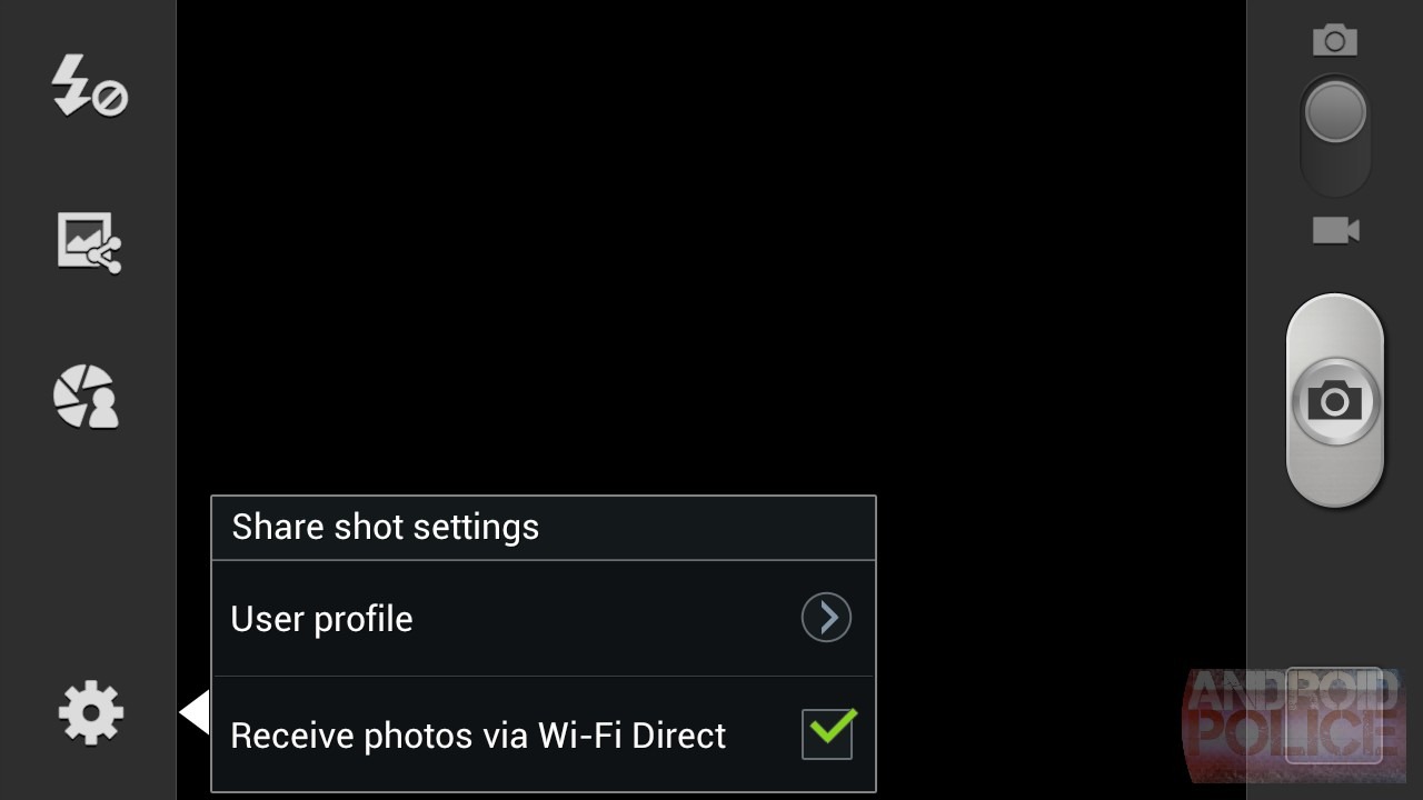


This uses Wi-Fi Direct to send every picture you take to everyone else. The theory is that you and all your GSIII toting friends have a party together, set up Wi-Fi Direct, enable share shot in the camera, and then everyone's pictures end up on everyone else's phone. Once you get it set up, it's cool. It works and it's really fast. Share Shot is probably the best feature out of the bunch. You do have a bunch of GSIII toting friends, don't you?
Wait, Does Anyone Have Local Files Anymore?
The real question I have with all this picture sharing stuff, though, is does anyone find it hard to share pictures now? Is this stuff a feature for marketing sake or is it actually solving a problem? I've never taken a picture and said "Man, I wish I had a way to share this with Bob, but I have no idea how to do that." If you have a picture you like and want to share, you put it on Facebook. You don't want to locally transfer it to anyone. And any music you're listening to is probably in cloud storage on Google or Amazon, or from a streaming service like Pandora or Spotify, which means S Beam isn't going to work.
This all seems completely backwards. Everything is cloud based now, so why is Samsung messing around with all these local file transfers? That, plus the fact that all of this stuff will only work with two or more Galaxy S IIIs, makes all of this a waste of time as far as I'm concerned.
The Evil Menu Button
The button layout of Menu, Home, and Back opens up a whole new can of worms. Menu, remember, is deprecated in ICS. The standards-setting Galaxy Nexus has a button arrangement of Back, Home, And Recent Apps. Samsung apparently didn't get the memo and stuck with a legacy menu button. This has some unfortunate consequences.
How to deal with a menu button: The Galaxy Nexus (Left), Evo 4G LTE (Center) and GSIII (Right)
Deciding to design your phone with hardware buttons presents a tough choice, you have to pick a layout, and because of how Ice Cream Sandwich works, neither option is ideal.
- The Galaxy Nexus has software buttons. All modern apps get the menu button in the top right (sometimes bottom right). The discoverability is great, because you see a menu button on the screen and think "Hey, there are more settings here." For old apps that need a menu button, it is added to the software bar, again with great discoverability, because it normally isn't there.
- The Evo 4G LTE has hardware buttons, and they omitted the menu button. New apps get the top right menu button with its great discoverability, but old apps bring up an on-screen menu button, It's not ideal, but the discoverability is still there though.
- The Galaxy S III has hardware buttons and included menu. Ice Cream Sandwich handles this terribly. You don't get an on screen button bar, but you don't get the top right menu button either. There is no discoverability at all. Nothing is on the screen to tell you there are more settings. You just have to spam the menu button in every app and guess.
Look at that screenshot on the right. You have no way of knowing if you have any menu options, and this happens in every app. It's the exact reason Google killed the menu button in the first place. You just have to blindly mash it on every screen and hope something happens. It's like we're back to having old-school Gingerbread phones. This is a step backwards for usability. I know most people are still stuck with menu buttons and Gingerbread, but as someone who's been and come back, I can tell you: not displaying the menu button on-screen sucks. The whole OS is harder to use with this layout.
Google should patch ICS to display the action bar menu button (the top right one) no matter what. Then I wouldn't have a huge problem with the GSIII button implementation, but as it stands right now it's significantly worse than other options. Modern apps include a space for menu - hiding it doesn't save you any useful space and, worst of all, it negates one of ICS's biggest usability boosts. Now we are back to playing the menu guessing game.
Samsung just doesn't Get It, either. All throughout the OS, Samsung has heavily abused the menu button. Just look at this:
It seems like, in every app, the menu is a mile long, scrollable catastrophe. Gallery, for instance, has twelve entries. No one will be able to find anything in this mess.
Lock Screen
The lock screen is completely customizable. By default, the screen is covered in water (nature!). Touching it causes little ripples to follow your finger around. If you don't like it, you can turn it off, just like everything else. It's up to you to make your lock screen as simple or as hideously complicated as you like.
You get a Clock (or 2 clocks) an information ticker, weather, 4 customizable app shortcuts, owner information, help text, and shortcuts to missed calls and texts.
The one non-removable item on the lock screen is the AT&T text. Unless you have the Sprint version. They don't see the need to shamelessly promote themselves on the lock screen. Also, as I'm sure you've noticed, AT&T insists on having itself in the status bar, too. Sprint doesn't. Go Sprint.
The information ticker can be set to news or stock. As you would expect, it scrolls horizontally when minimized, and you can drag it upwards and see more stocks or news, at which point turns into a vertically scrolling list. You can't pick specific RSS feeds for the news ticker, but there are several pre-defined categories to choose from. You do get to pick your stocks though.
"Camera Quick Access" is a kind-of-strange little gesture. Hold your finger on the phone, twist 90 degrees, and the camera opens. Neat! This is a little hard to get used to, but it always works.
The lock screen also shows missed calls and text messages, and swiping from inside the circles will allow you to jump to that app. Sadly, it doesn't notify you of email, IM, Google Voice message, or anything else. Boy, are they nice looking though.
The third picture is of the lock screen music player. (There isn't one).
Home Screen
The home screen is relatively standard Ice Cream Sandwich fare. You get 7 home screens, the app drawer is partitioned off into Apps and Widgets, and everything scrolls horizontally. Next to apps and widgets is a down arrow button that will bring up a page with only your downloaded applications.
I guess Downloaded Applications is sorted by install time? This sorting doesn't make any sense to me.
Dragging an item out of the App Drawer brings up this little dock at the bottom. This has the interesting side effect of not allowing you to drag an icon from the App Drawer to the dock, you have to put it on the desktop first. From the desktop, picking up an icon will not bring up the options dock, so you can drop it into the regular dock.
The last picture is what you get when you pinch zoom out. It's a hybrid "jump to page/edit" screen. You can reorder pages, set a home page, and add or delete pages.
Samsung went out of their way to break folder creation. You can no longer just drag one icon on top of another and make a folder, you have to press menu (ugh), then Create Folder, then you get an empty folder to play with. Folders don't look like the cool little circles anymore, they're back to boring, grey, folders.
The menu button, as usual, is hiding several options that you will only discover by dumb luck. "Edit" is for rearranging and delete home screen pages, it's the same screen as pinch zoom.
"Uninstall" brings up the second picture, tapping on a minus brings up an "Are you sure?" box, and clicking ok makes the app go away without any fuss. No progress bar or interstitial screen or anything. I love it.
"Hide Applications" is another great interface, most launchers bring up a vertically scrolling list, where it can be difficult to find that annoying icon, but Samsung's home screen lets you put a checkmark directly next to the little bugger to make it disappear.
"View Type" allows you to choose different app drawer styles. Alphabetical grid is the default - you should know how that works. Alphabetical List is interesting. It's a vertical list of all your apps, and there's even a letter slider on the right for you app junkies with a million programs. The menu button is a serious disappointment in this mode though, you lose access to all of the neat features like hiding apps and uninstalling.
Customizable Grid lets you arrange the app drawer however you want, and you can even have folders in there. Crazy.
Recent Apps
Anyone who has experienced Sense 4.0 will be relieved to hear that Samsung has opted not to horribly mutilate the Recent Apps screen. Good call. The ever-handy long-press-App-Info shortcut (for easy force closes) is still intact, too.
They did add some stupid buttons, though. I guess Sammy couldn't help themselves. Protip guys: Android normally doesn't need a task manager, and it certainly doesn't need a task manager when you pack in 2 gigs of ram.
Notification Panel
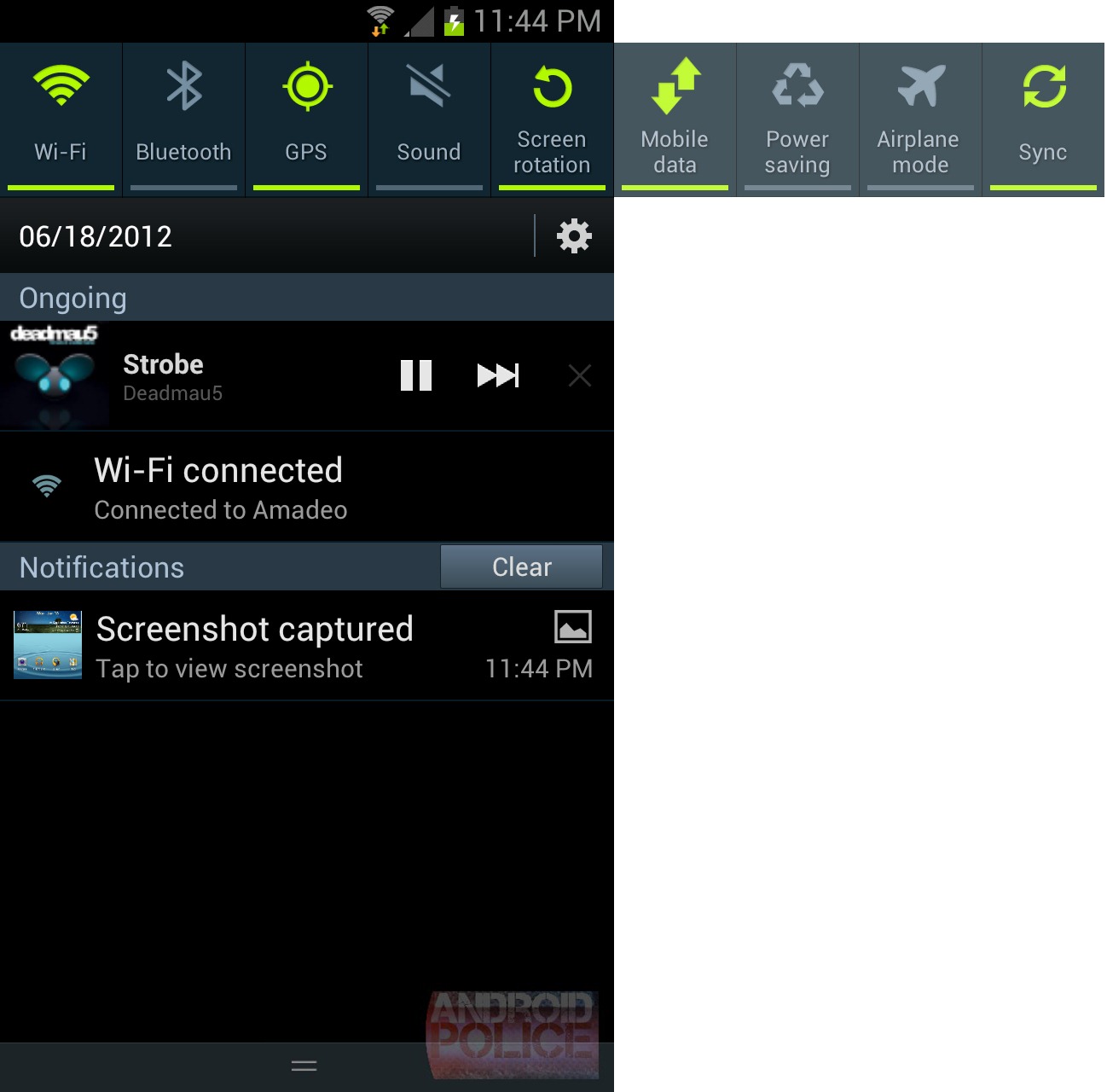

Samsung's trailblazing notification power controls are still here, and they scroll now! As far as I can tell you can't customize them in anyway, so I hope you like what's up there and the order they're in, because they're staying that way.
The Notification panel gets all the ICS upgrades too. Music players get pause, next, and close controls, and everything gets a nice little thumbnail.
You may have already noticed, but I have to point out that the AT&T version insists on having a permanent "You are connected to Wi-Fi" notification. You can't turn it off, you can't dismiss it, it's there forever. The Sprint version, again, is much less annoying and functions normally.
Keyboard
Text prediction on this keyboard is awful. It does all the text prediction in-line. So in the first picture, I've typed "Thi" (on my way to "This"), the keyboard suggests "Thai" as the most-likely word, and automatically puts this in my text field. I like to look at the text field when I'm typing, and having it throw a bunch of letters in there that I don't want to type throws me for a loop - I'm always reaching for the backspace button. The predictive text area is there for a reason, that's where predictive text goes, not in my text field.
Maybe an example will help. Let's type "Android Police." Compare what I'm typing (shown as the first entry in the text prediction bar) and what the keyboard puts out, and tell me this wouldn't confuse the crap out of you.
And - no problems so far. (Pic 1) r - nothing happens. We're still at "And." (Pic 2) o - So far I've typed "Andro" but the text field shows "Andre." Huh? I never typed an "E," where did that come from? (Pic 3) i - I've typed "Androi" and the screen shows "Andrei." That sure looks like a typo to me. (Pic 4) d - finally we've arrived at "Android." That was scary.
Po changes to "P.O." add an li and you get "Pool." Great. Add a c and you get "colic." Ok I give up. The ICS keyboard just types whatever you type, and inserts the word suggestion when you hit space, that's much easier. This doesn't make any sense to a normal person. The text prediction always makes it look like I've made a typo, or that a key press didn't register. It's all very distracting. Good thing keyboards are replaceable. The stock keyboard isn't on this though.
Punctuation is a lot slower than the stock ICS keyboard too. On stock Android, you can long press on the period, slide your finger over to the punctuation you want, release, and it will type. The Samsung keyboard requires a long press and a tap. Boo. That was a nice time saver.
Spell Check doesn't work either. If you type a word incorrectly, deal. You don't get the nice red underlines and easy correction like you do on stock Android.
Should you get horribly frustrated with the qwerty keyboard (you will), you've got a couple alternative text inputs at your disposal. There's T9 trace, which is Nuance's Swype clone. A T9 keyboard, for those that haven't grown out of keypad typing, and a crazy handwriting keyboard.
Long pressing on the microphone reveals buttons for handwriting recognition, settings, and the coolest thing in the history of Android keyboards: A Clipboard! You can copy text, screenshots, and Gallery pictures to it, and it will remember the last 20 items and present them in a vertically scrollable list. A tap will paste them into your current field. Awesome.
Gmail can't handle pasted pictures, that's why they are greyed out in the picture. The only thing I've seen that can handle pasted pictures are the texting app and the included memo pad.
Skinned Apps
It's pretty difficult to get any of the stock apps back, so anything they skin is worth pointing out. We'll do a quick rundown.
Calculator
This calculator in landscape is actually better than the stock one, you can see both the normal and advanced panels at once, cool. Samsung also added a few extra advanced functions over the stock calculator, which I do not understand in anyway. You can even adjust the text size if you remember that there is a menu button.
Calendar
Calendar is a brown, skeuomorphic, usability mess.
So much brown.
First up, we've got the newly-added year view (hooray for HD screens!). The navigation tabs appear and disappear when you click the arrow in the top right corner, or rotate to horizontal mode. The tabs are attached to your calendar, and, when you tap the arrow in the top right, the whole calendar slides over to reveal them. This animation and their placement suggests a quick horizontal swipe would open the tabs, but sadly, that's not the case. Horizontal swipes navigate you from 1 year/month/week/day to another, the only way to bring up the tabs is with the arrow button or landscape. As you would expect, a single tap on a month will bring you to month view.
Left: Stock ICS, doing it wrong. Center: HTC's calendar, do it REALLY wrong, and Right: Samsung's month view
Month view is awesome. The stock ICS calendar presents you with abstract colored lines, which I guess is supposed to show you appointment density, but in reality it's pretty useless. HTC is even worse, they completely gives up and show you a blank calendar. Samsung, though, they take full advantage of the S3's HD resolution and show you a month view with actual appointments on it.
Month view shows you the first two appointments for each day, and has little +1 symbols in the top right corner of each day to indicate more events. At the bottom there's a scrollable list of each day. One tap on a day will switch the list, a second tap will jump to week view. Everyone needs to copy this (Minus the brown and faux leather).
Week view is mostly untouched from the stock ICS implementation, and that's good, because week view is the most useful calendar screen. The coolest new feature in the stock ICS calendar is the ability to use pinch zoom to adjust the time scale for the day and week view. So, in the picture above, the time scale shows 10am-5pm, a pinch out would condense everything and allow me to see more hours at once. Samsung has completely ruined this.
Pinch zoom is now used for navigation. Pinch zooming out from week view will change to month view. Pinch zooming in from here will change to day view. This is in addition to being able to tap on a day to zoom in and hitting the back button to go back. And there's about a half second delay between the end of your pinch zoom and the changing of calendars. It's the most awkward thing I've ever seen.
So how do you zoom in? The menu button. Menu -> Zoom in will zoom in 1 increment. If you want to significantly change the zoom you're going to have to do that a couple times. Yuck.
I should also note that, system wide, Samsung got rid of the flingable, date and time pickers from ICS (left). Those were fun. I miss them. In their place is a boring, old up/down date and time picker. The one nice thing is will do it let you type directly in the box, it even brings up a custom keyboard for the month. Cool. This might even be faster than the flingable ones.
Time will increment other fields at the appropriate thresholds (ie pressing down on 12pm switches to 11am, not 11pm) but the date does not (going past 31 does not change the month). I'm not sure if I like incremention or not, but you should at least be consistent.
And just for completeness, here's agenda, day, and tasks. Agenda views has collapsible dates, and the rest is pretty standard stuff.
I wish I could pick and choose features from this. The month view is awesome, and year view is nice to have, but the removable of pinch zoom, crazy navigation, and all the brown makes me want to stay away from this.
Clock
You get the usual suite of clock options: Alarms, world clock, stopwatch and timer. You still get the "Alarm set for xx hours and minutes from now" message (pic #1), which saves my life at least once a week. There is even a "Smart Alarm" which will slowly ramp up the volume, as opposed to shocking you out of bed. Nice.
Contacts & Phone
Contacts and Phone are sort of the same app, and sort of not. They look the same, and have mostly the same tabs, just in a different order, and sometimes with different names.
We've got the contacts app on top, and the phone app on the bottom. The contacts tabs are Phone, Groups, Contacts, Favorites, but the Phone tab isn't a tab, it just opens the Phone app. In the Phone app though, your tabs are different. Things switch around to Keypad (which is the Phone), Logs, Favorites, Contacts. The Contacts tab jumps you back to the Contacts app, so your tabs switch again. Did you get all that? Favorites and Contacts are constantly switching positions, and Groups and Logs jump in and out. It's crazy. 5 tabs across 2 apps, and one tab has two different names.
In the positive category, the dialer does all the neat T9 and phone number searching that you'd expect. This is the also first time I've seen a phone ship with horizontal dialer support. Car dock users rejoice! Unfortunately, once a call starts, it's back to sideways dialing. Why do one and not the other?
The call screens have gotten a pretty ugly skinning, but functionality-wise, they are pretty much the same.
Gallery
The Gallery has escaped relatively unscathed. You get an ugly blue bar instead of the minimalist flat black one in stock ICS. They have broken the "Up" button (that's the top right app icon, that is supposed to take you back a screen in the app) in the view picture screen though. So if you do something like, take a screenshot and look at it, there's no way to get back to the album view unless you hit back enough times to close the app, and reopen it again.
Like I said earlier, the Gallery has facial recognition and will try to tag your friends. That's where the "Person" section of the Gallery comes it. There is a special album in under "Person" called "untagged" which is where is puts people it doesn't recognize, and asks you who that person is. In the right screenshot we can see it would like to know the name of my email icon. Great.
Crapware
Things are surprisingly light on the crapware front.
AT&T only
- AT&T Navigator - Google Maps is overrated! I'm sure AT&T Navigator is just as good! And at $10 a month, it's a bargain! Right? Guys?
- AT&T Messages - This is just a link to the Play Store to download the actual AT&T Messages. It can't even do that right. No thanks.
- Device Help - A bookmark to AT&T's help website.
- myAT&T - Another Play Store link. This one actually made it to the store.
- YP Mobile - Yellow Pages Mobile. Before computers, phone companies used to produce giant paper books full of business listings every year. The pages were actually yellow, so people referred to the book as "The Yellow Pages." This app is named after that. It's sort of like calling your navigation app "Horse Directions."
Sprint Only
- Sprint Hotspot - Sure this has been built in to Android since Gingerbread, the problem is there's not way to charge you extra through the built in mechanism.
- Sprint Zone - A collection of web page bookmarks.
- Voicemail - Again, it's built into ICS, but there's no where to type in a credit card number.
Both
- ChatON - This is Samsung's chat platform. People are identified not by email, or account name, but by phone number. Oh and check out that fine print: "The ChatON logo is different for Canada." Good to know.
- Game Hub - It's an App store. For Games. This must be very old, the thumbnails are super blurry, and the web page shows it running on an Omnia II. The Omnia II ran Windows Mobile 6.1.
- Media Hub - You can buy Movies and TV Shows direct from Samsung! The Daily Show, available for free online, is $2 an episode.
- S Suggest - Another app store. This one has recommendations from your friends. Your friends with Samsung accounts.
- Samsung Apps - App Store #3. And they've all been from Samsung. Pick one and delete the others, then delete the one that's left.
So there you go. 10 garbage apps on AT&T and 8 on Sprint. Good show of restraint, guys.
The really really good news is that every single one of these can be disabled. No one went out of their way to mess with ICS.
Battery Life
The battery life is excellent. I'll get 10-11 hours on a charge with heavy usage. The biggest power sucker, as usual, is the screen, and I normally keep mine at max brightness (it looks prettier).
In the right screen shot, AllShare Play blew up a whole 6% of my battery from that 1.1GB file transfer. So if you value your battery life, stay away from Wi-Fi Direct.
The single greatest feature of the battery is that it's removable. If it's broken get a new one; if it doesn't last long enough, buy a second one. Removable batteries are awesome.
Conclusion
It's fast. It's slim. It's got Android 4.0. It's hard not to recommend. The GSIII won't blow your mind or anything, but if you haven't upgraded in a while, and you can stand all the plastic, it's hard to go wrong here.
The camera is easily the GSIIIs best feature. It struggles to fill the full 8 megapixel resolution, but no one really needs pictures that big from a phone anyway. I would call it an excellent 7 megapixel camera.
The worst part? The Menu button. It makes everything more difficult to use. Between hiding the in-app menu button for the stock apps, and packing their own menu with items, Samsung has negated the biggest user interface improvement in ICS. It's really a shame that this is how millions of people will experience Ice Cream Sandwich - just as confusing and difficult to use as Gingerbread was.
Samsung has put a lot of effort into Touchwiz, and the result is a bunch of extremely trivial changes. Most of the new features are borderline-gimmicks that don't solve any real problems. Touchwiz is also pretty ugly. The good news is that, since most of the things in Touchwiz are additive, you can just ignore the useless stuff. It's mostly a wash.
So GSIII or One X? I know everyone is going to ask. It's sort of a toss-up. The One X has a better screen and better design, but you're losing a removable battery and MicroSD card. Most have menu issues too. The One X shows way too much menu, and the GSIII doesn't show enough. They're two opposite ends of the spectrum. I guess if I really had to pick, the camera and less-terrible skin job would make me side with the GSIII.
If you've got a GSII: upgrade. Upgrade now. The cumulative effect of the speed boost, better camera, higher res screen, notification LED, and new software make it a no-brainer. That's kind of the appeal of the S III; no one feature is going to make you run out and buy it, but if you've got an older phone, it will be a solid upgrade in every category. That's really how I feel about the GSIII; it's not revolutionary, it's just another step in the steady, forward march of Android.