Finally. It's real.
After all the rumored release dates, and Verizon's best efforts to sweep this phone under the carpet, the Galaxy Nexus for Verizon is real. It's real and I have one.
I picked it up on launch day at 8am, at a pretty busy Verizon store. I went on a long Ice Cream Sandwich bender, and now I'm here to report my first impressions.
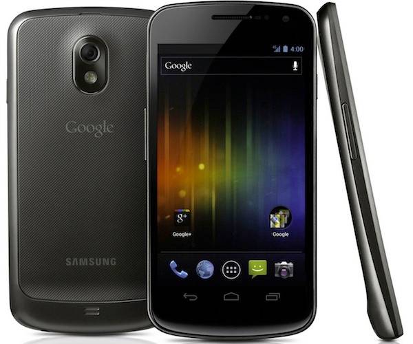
First off, forget all that technical Pentile stuff. I want to hate Pentile, I really do, but the screen is just gorgeous. I'm normally the type to complain about Pentile's checkerboard layout, but the pixels are so tiny I just can't see it. No one else notices it either, everyone that sees the phone marvels at how good it looks. Black pixels give off no light, and colors jump off the screen. Set a black background and you won't know where the screen stops and the bezel starts.
The screen isn't perfect, there are one or two shades of colors that show some banding (like Rom Manager's dark grey background), but 95% of the time the screen just blows me away. You've got to turn off auto brightness though. It's just wrong. It's always too dim and makes the screen look ugly.
Ice Cream Sandwich is a revolution. The virtual buttons work exactly like they should. They rotate when you rotate the phone, menu only pops up when you need it, and they hide when you watch a full screen video. The whole OS and most Google apps received a loving coat of polish. Android has finally been designed rather than just assembled by some programmer with no eye for aesthetics. It's going to be a real shame when OEMs ruin this.
The lack of a search button is already killing me. Having to go back to the home screen and hunt for the voice button makes Voice Actions much less useful. It almost seems like they don't think voice commands are important any more.
The Google bar is a permanent fixture at the top of the home screen. I really wanted to put Icons there. In terms of picking a homescreen app, stealing 4 slots from me for a stupid search bar is really a deal breaker. XDA has a bar less version that's getting installed as soon as I am done taking screenshots.

The front of the phone is just striking. Google somehow managed to keep all carrier and manufacturer logos off the front. The screen is slightly curved and, in most lighting conditions, it's very hard to distinguish the screen from the bezel. The result is an uninterrupted, black obelisk of a phone that just oozes sex. This is how things should be designed.
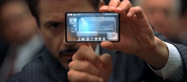
The virtual buttons allow the bezel to be cut down considerably. Put on a full screen video and you'll just be astounded by how little bezel there is. We are definitely one step closer to Tony Starks phone.
The whole phone feels very expensive. The aforementioned black obelisk effect gives off a very high tech vibe. The subtle curve on the front and back of the phone and decent weight gives it a very classy feel in-hand. I just wish the back had the same faux-leather backing as some of the GSII variants. This back is just textured plastic.
I'll have the full review up in a few days. There is just so much to talk about. I can already tell that this is the phone everything else will be measured against for a long time. It's by no means perfect though. I'll talk about all that in the full review.
Oh, by the way, you know all the pictures in this article? They were all taken with a second Galaxy Nexus. So you've just formed an unbiased opinion about the camera. Surprise!
Is there anything special you'd like to see me address in the review? Leave a comment and I'll try my best. We'll talk again in a few days.