Welcome to the sixth edition of GTKA4.0! If you are somehow just joining us, where have you been? You've only been missing the most comprehensive coverage of Ice Cream Sandwich on the internet. If you need to catch up, we already covered Gmail, Google Talk, YouTube, Calendar, and People (Contacts).
This article is for all the old school people out there that actually make phone calls with their smartphones. Today we're examining the Dialer.
For no reason other than tradition, here are some completely unenlightening about screens:
This time both versions are from emulators. "Dialer" gets a name change to "Phone," and version numbers just match the OS version. Like I said, unenlightening.
Dialer
I guess we should start with the dialing part of the dialer. Like I said in the People article, the Dialer has been spun out into its own, separate app. Across the top, the tabs are now Dialer, Call Log, and Favorites.
Just when you thought the dial screen couldn't get any starker, ICS ups the ante by dropping the blocks around the current phone number and bottom buttons. We've got even less going on now.
Everything looks a little cleaner. Button numbers are more prominent, and done up in ICS blue. The button bottoms are now more like underscores, and give a nice base to the button letters. Roboto is really showing its stuff here, look at the curve on that "7."
Buttons have been switched around a bit. Voicemail has moved from the bottom to the "1" button. A long press will get you connected. Contacts has not completely left the dialer, the bottom left button will bring up contacts search. As for just typing in numbers, there's no T9 search, but it will match numbers against your contacts.
Am I reading too much into things, or does the new, rotated phone icon seem more... inviting? By pointing up, it gives off more of a "pick up" vibe than "hang up" one.
Phone Calls
Oh hey, Jessica's calling!
Wow, does Gingerbread look awful. It looks like they just slapped all the necessary fields on the screen, hit "Center" and called it a day. This was definitely designed by the same guy that wrote the telephony stack, as opposed to design by, you know, a designer.
ICS is a completely different story. Designers actually decided to make use of the screen. The background is now a high res picture of the person calling, and the layout is much better. The name and phone number get a transparent black overlay, and "Incoming Call" gets a nice, blue background.
The star of this screen is the cool answer slider at the bottom. While the phone is ringing, the little waves animate outward, inviting you to touch the phone circle. The background here is a little weird. Transparent black would probably be better looking than solid black; I can't see the bottom half of the picture!
Touching the phone circle lights up three icons. There's options for Ignore, answer, and the new one, reply with text message. The usage is exactly like the Honeycomb and ICS lock screen, just drag the circle to whatever you want. Picking text message will bring up a few canned messages, and the option to add your own. Very handy.
Time to actually answer this call:
Seriously, Gingerbread, why is "Hold" all the way up there, away from the other buttons? Did it get lost? Did you misplace it? What is going on? ICS actually puts all the buttons in the same spot: the bottom. Genius.
Now we've got the buttons arranged much more logical manner, the most used button is now the biggest. Along the bottom there's the dial pad, speaker phone, mute, hold, and add call. It's much more organized and friendlier.
You might have noticed Gingerbread has a status bar notification for a call and ICS doesn't. But don't worry, It will appear if you leave the phone app while you're on a call.
Here we can see what happens when we enable a few options. Any activated buttons get a thick blue line underneath of them. "On Hold" shows up as a blue strip under the name and number.
I would show you a horizontal screenshot, but there still isn't horizontal support. I'm not kidding. Take all these screenshots, rotate them 90 degrees, and that's your horizontal mode. Apparently speaker phone in a car dock isn't a use case Google cares about.
Ending a call in Gingerbread automatically opens the call log. No one really ever wants it to do that. ICS takes the insanity a step further and locks the phone after ending a phone call. You hang up, and are greeted with a lock screen. Why? Ending a call should be like ending any other task. Just send me back to whatever I was doing!
Call Log
The call log is much prettier. Contact pictures make a huge difference. They are now attached to every entry, which also adds the cool side effect of contact card access. Gingerbread made grouped calls an expandable list, in ICS they are listed as one item with multiple incoming/outgoing arrows (like in the first entry).
There is a search button at the bottom, but it's just the normal contact search, it doesn't search your call log.
The call details screen has actually had some though put into it now. At the top there's a People-style giant image header, and the screen will now list each call in a group. It's good to see the whole screen actually being used for information, in Gingerbread half of the screen was always empty.
The completely blank action bar is really stupid looking though.
Favorites
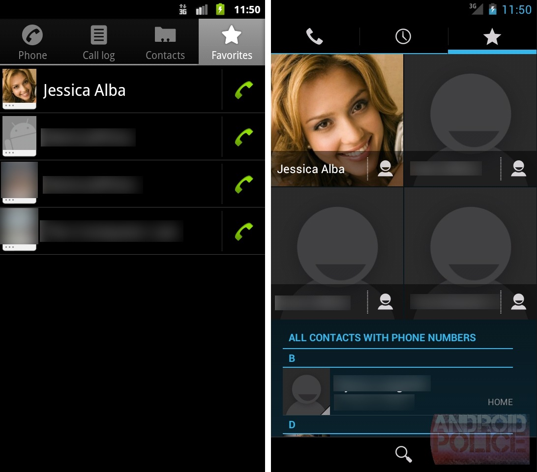

This is a surprise. I expected favorites to be a carbon copy of the People version, but they've gone and tacked "All Contacts" to the bottom of it. That will be helpful when you think a contact is a favorite, but really isn't, and its just nice to still be able to reach all your contacts from the dialer.
Tapping a favorite will call them and the little contact icon will open their contact page.
Search
Search will now list all of contact's phone number inline, and tapping on it will call that number. That's one less tap than Gingerbread, which will bring up a "pick a number" popup for contacts with multiple numbers. ICS seems to search "All contacts" by default, and Gingerbread charges you an extra tap for that feature.
In People, search does text highlighting on the results list, so above the "Jess" in "Jessica" would be a different color. It seems to be left out of the dialer search, it was a nice touch, I miss it.
Voicemail
Somewhere in this app is a visual voicemail interface. The emulator can't access it, so we'll just have to look at this picture from the ICS unveiling in Taiwan. Voicemails will show up in the call log, and tapping them will bring you this screen. The plus and minus buttons will speed up the playback, and it looks like you have pause and speakerphone buttons.
Wrap Up
I'm very disappointed at the lack of a horizontal mode throughout the dialer. If you like to use speakerphone in a car dock you'll be dealing with a sideways screen. It's horrible.
Design wise, we got a nice upgrade. The Gingerbread version of Dialer was an ugly mess; ICS whipped it into shape. This is one of the few ICS designs that is actually dark, so AMOLED battery enthusiasts can stop posting basically the same comment in every single article (just kidding, I love you guys).
We even get new features with this update. Replying to a phone call with a text message is a brilliant idea. Expect every other OS to copy this in a few months. Built in visual voicemail (should you choose to pay for it) frees you from carrier crapware apps.
New design and new features? It's hard to ask for any more than that. (Other than, you know, a horizontal mode.)