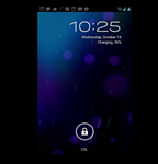
One of Android's new features that was stressed pretty heavily on stage tonight was Roboto, a system font created specifically for Ice Cream Sandwich, which, in all honesty, looks a lot better than the system fonts we've seen before.
At first I questioned why it was necessary to spend so much time discussing a simple type face (one without even a hint of a serif), but when I thought about it, it made sense - most of the things we do on Android devices involve letters and numbers in some way, and why not make those characters aesthetically pleasing? It's a relatively small touch that goes a long way in terms of user experience.
As I mentioned, Roboto is a sans-serif font, keeping things simple and smooth. Its characters have a pleasing roundness, and are spaced rather nicely, making e-mails, clocks, and menus easy on the eyes, and, in the words of one presenter, "a pleasure to read."
Again, Roboto may be a small touch, but it's just one of the numerous new additions to Android that make Ice Cream Sandwich the the best mobile OS Google has yet cooked up.

